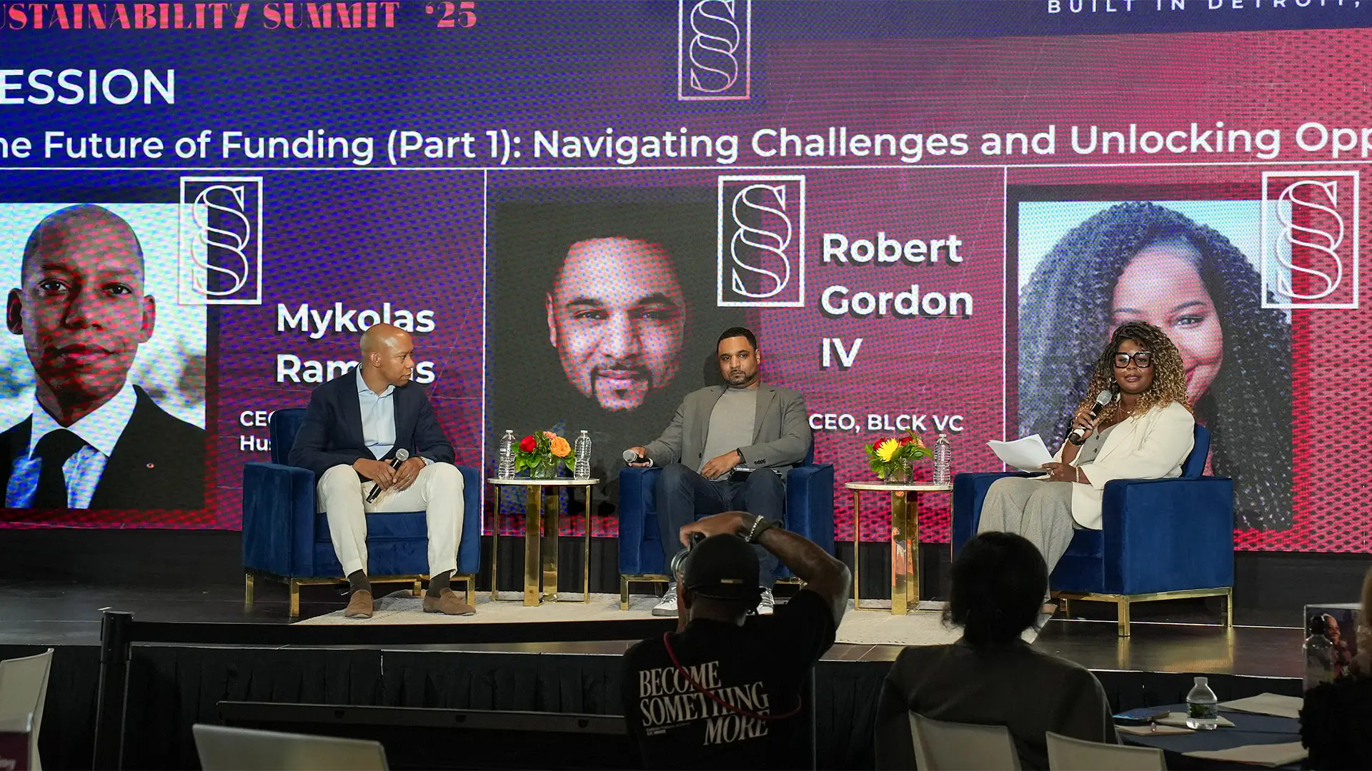

The Sustainability Summit ran four times between 2022 and 2025, moving from Miami to Detroit, and Studio J Lorne carried the identity across every edition: a typeface drawn in-house, wayfinding, environmental design, merchandise and campaign artwork. The final summit had to feel more encompassing than anything before it, because it was both a send-off and a beginning, closing four years of gathering while planting BIA in Detroit for good.
BIA is a hub for the people who support entrepreneurs, which means the summit was never a conference in the usual sense. The organizations BIA serves spend their year giving trust, resources and skills to founders on the ground, and once a year the summit gives all of that back to them: the network, the tools, and the rest they need to sustain the work. It runs closer to a family reunion than an industry event. The final edition carried one more job on top of that, solidifying BIA’s relationship with Detroit and its Black entrepreneurs, a relationship still bearing fruit today.
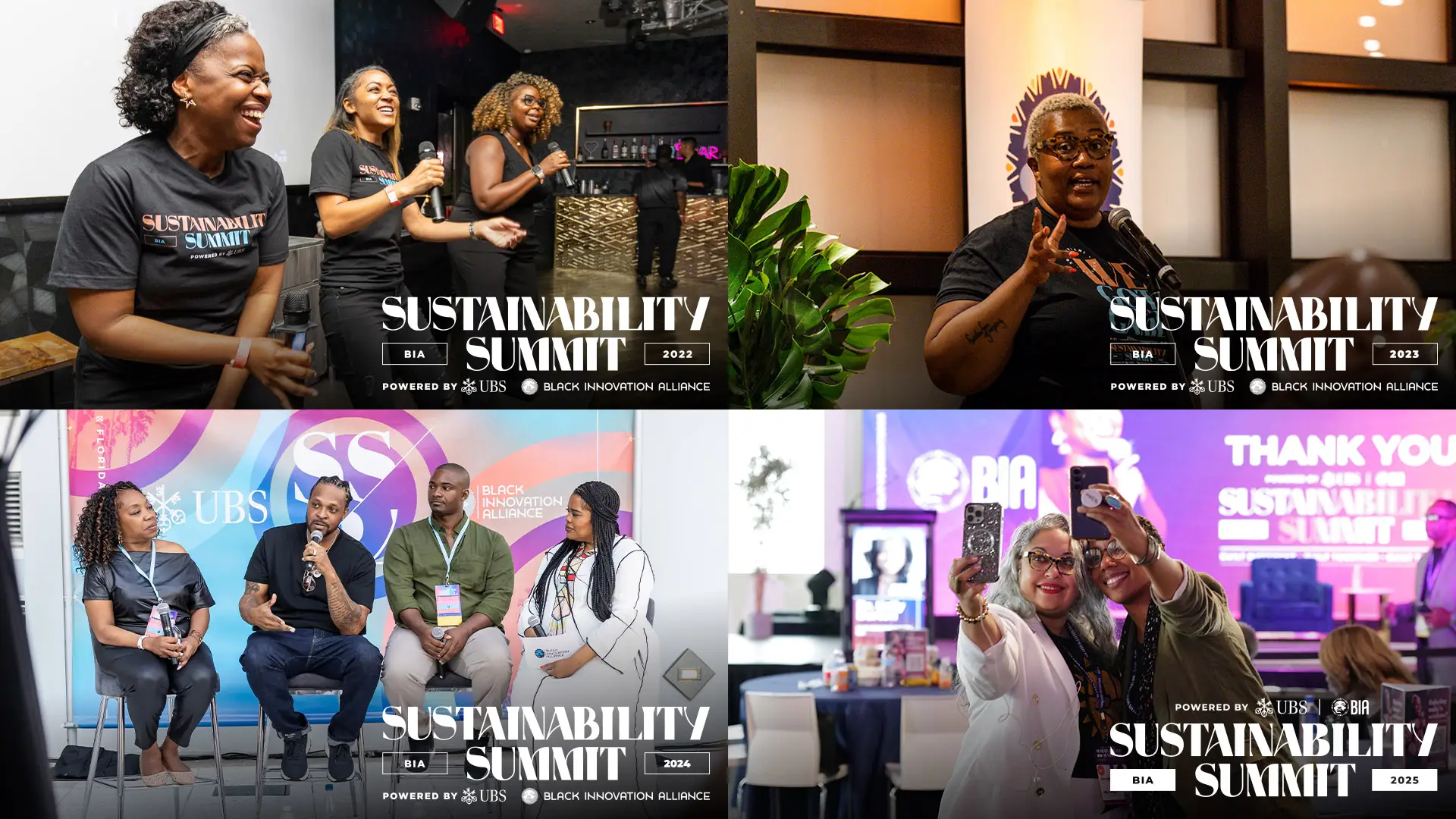
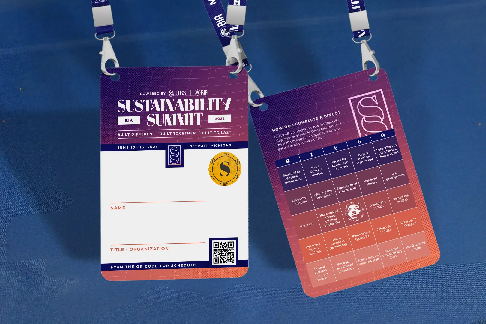
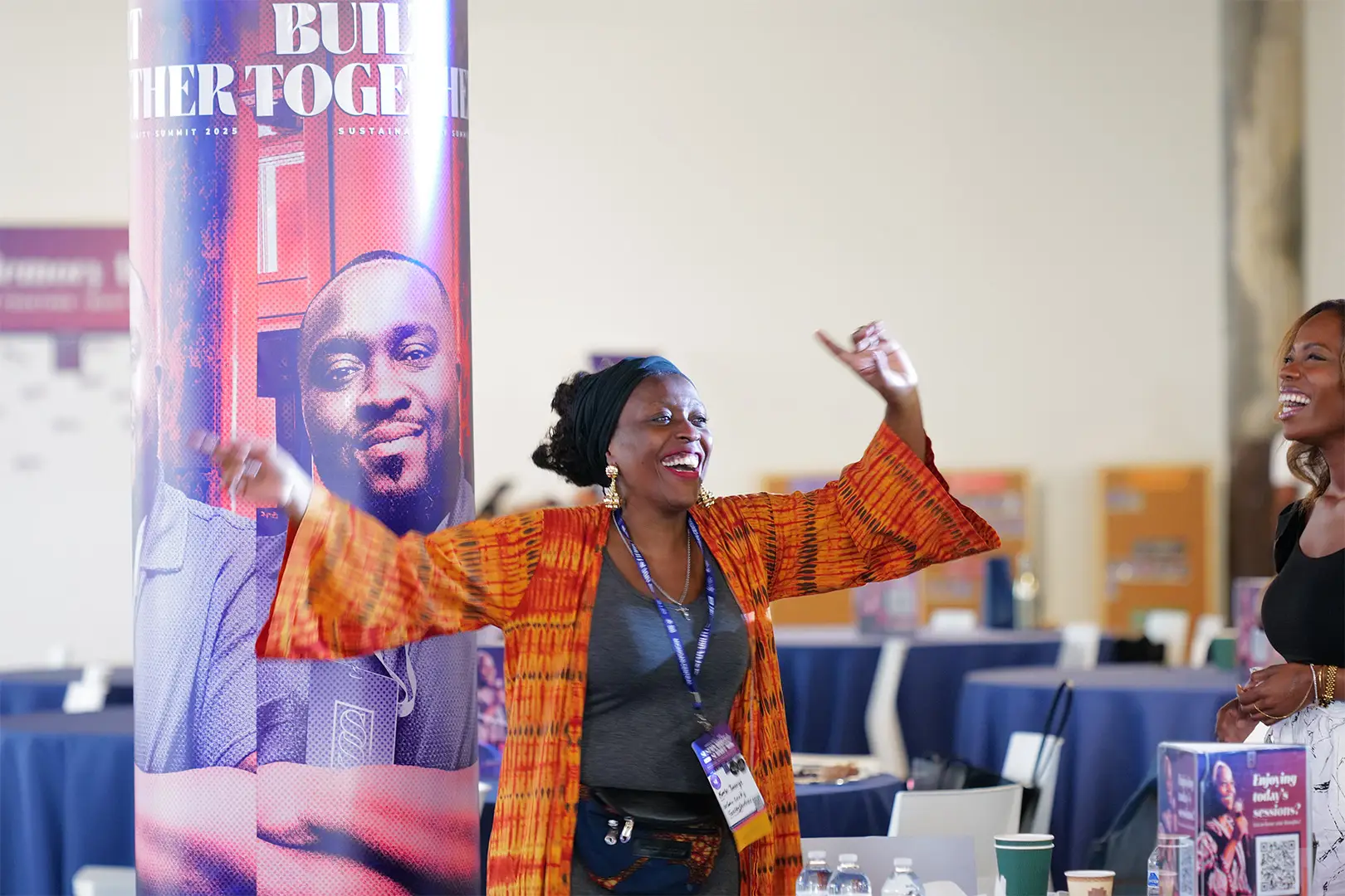
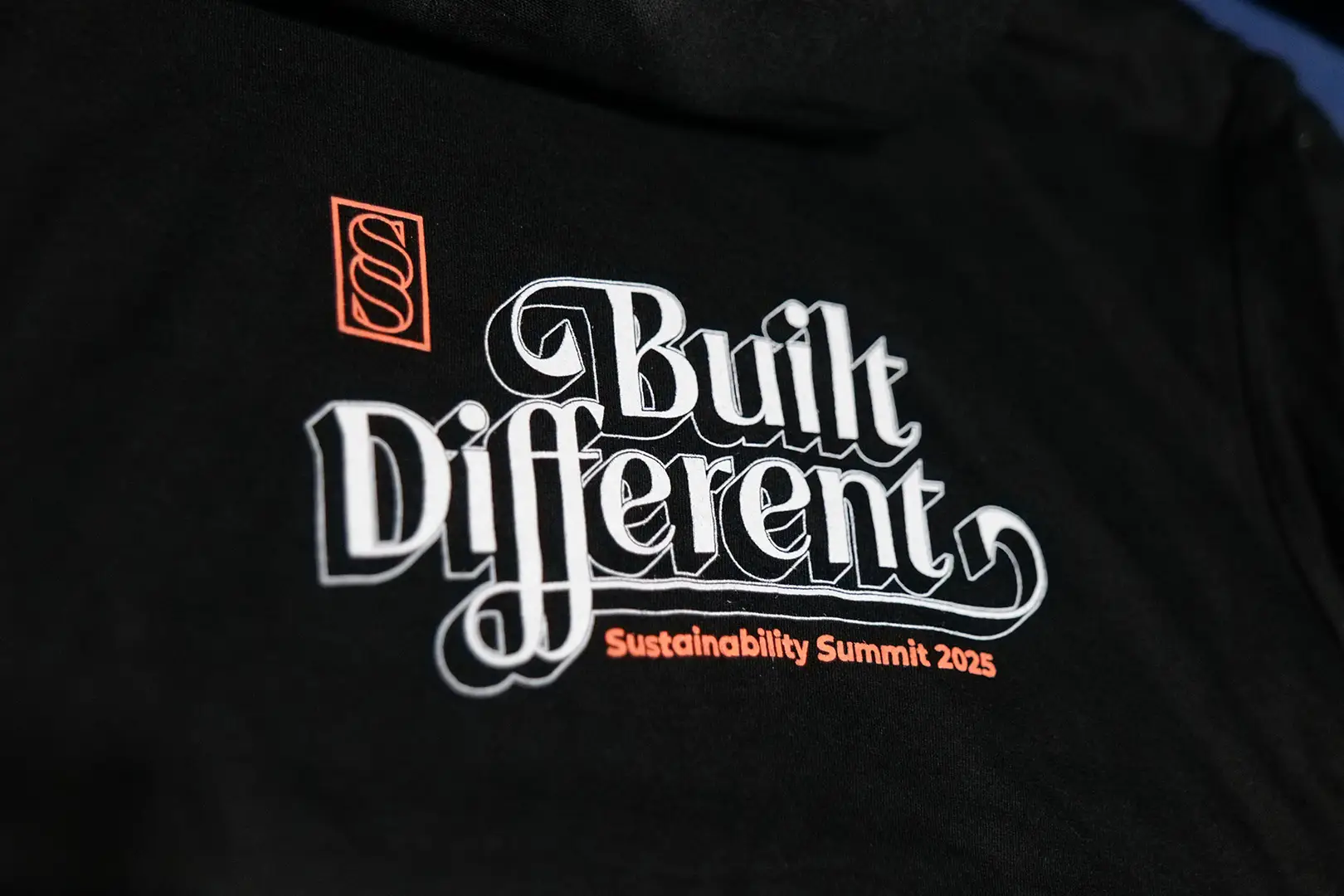
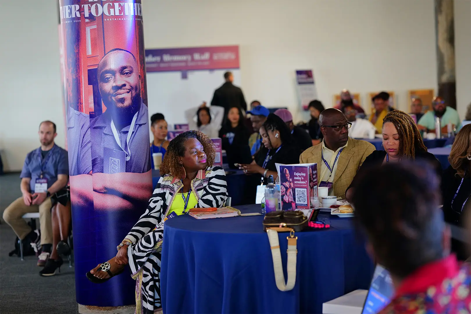
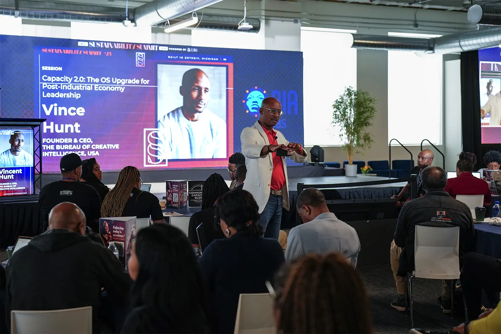
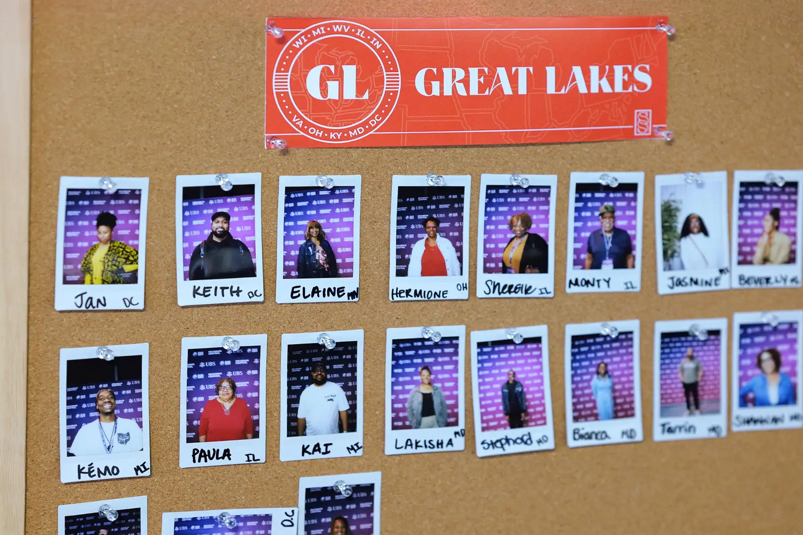
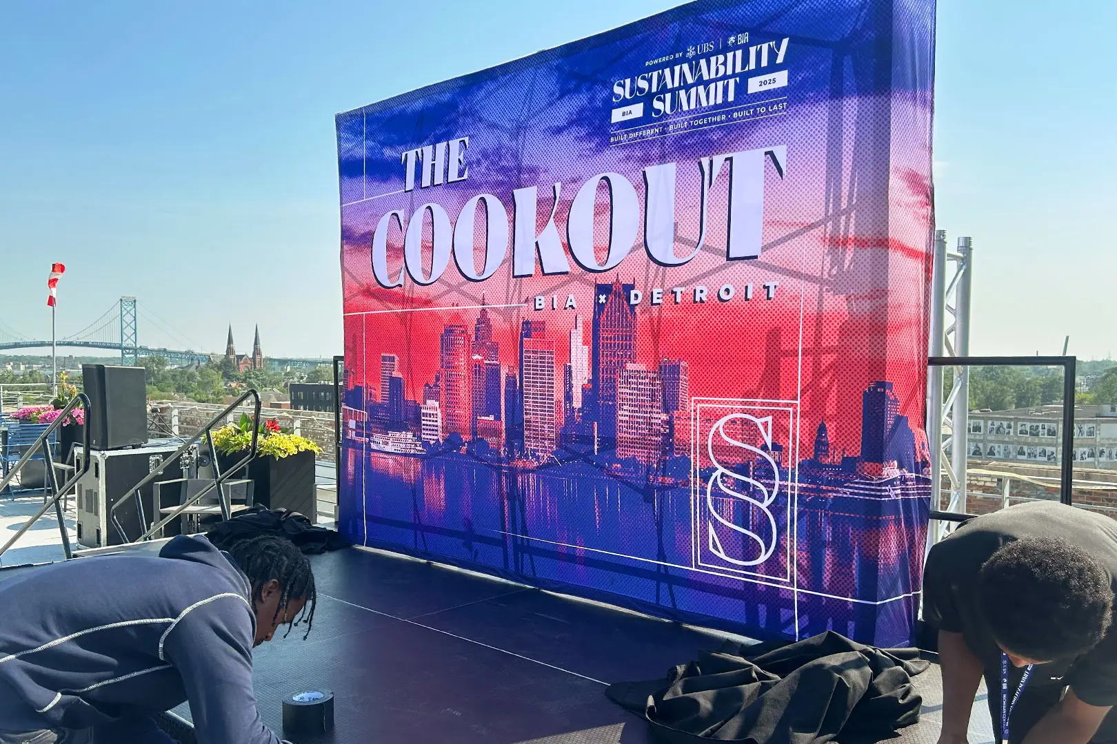
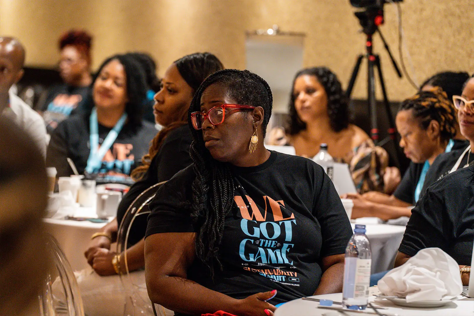
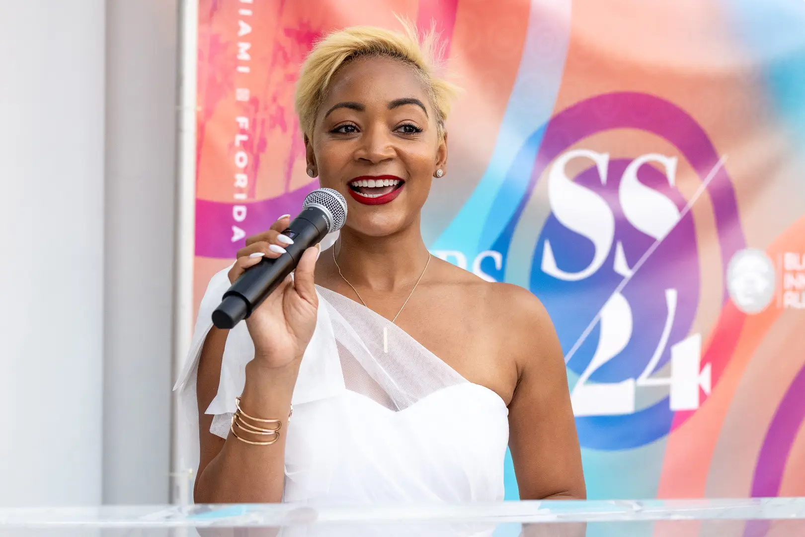
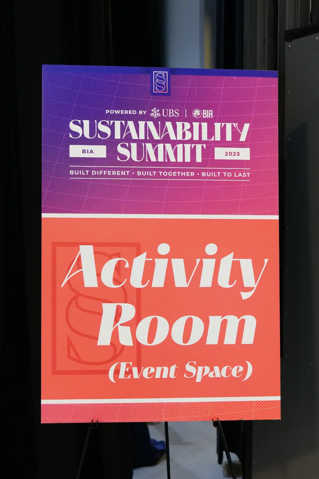
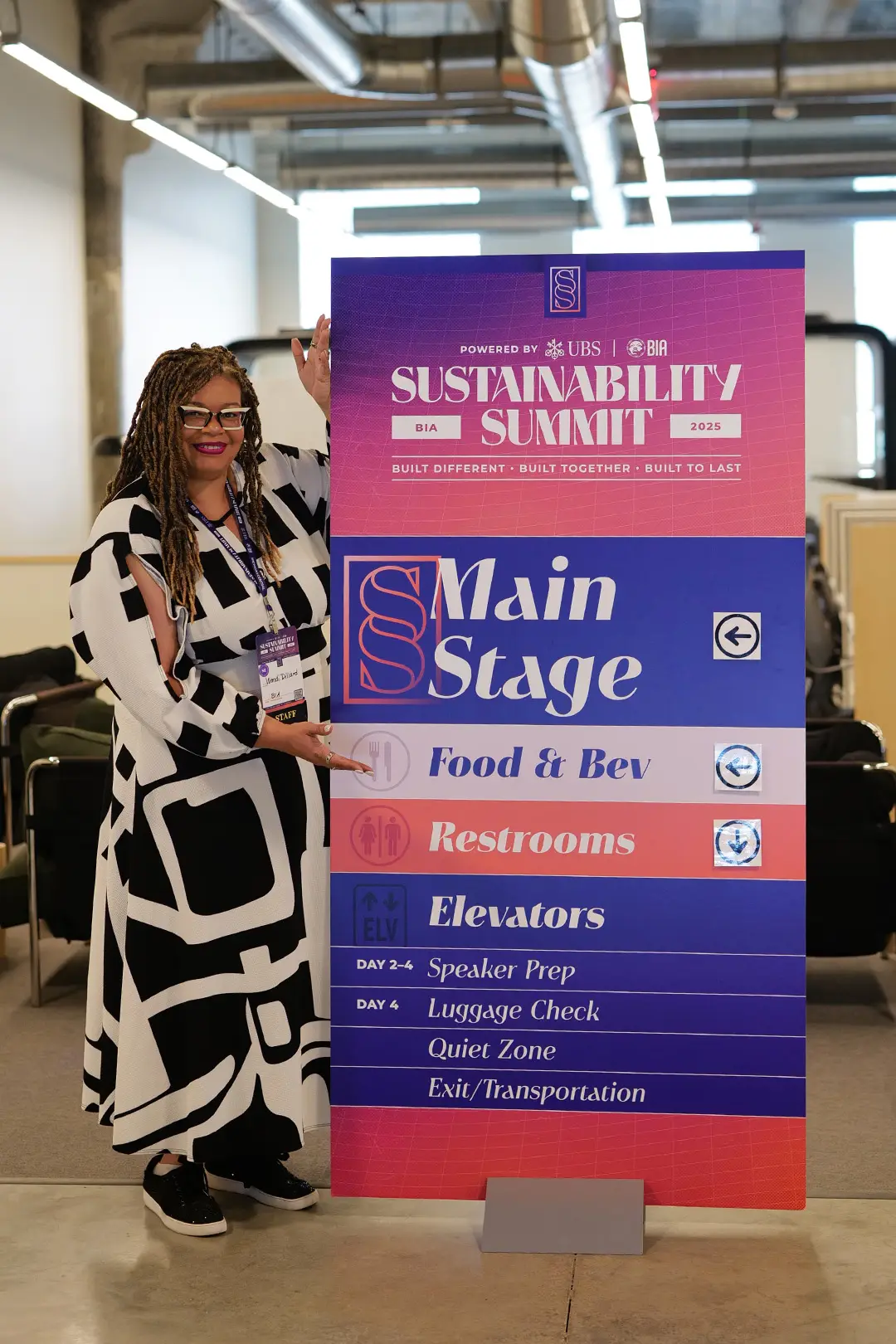
The identity started with TYTE, an all-caps typeface Jason drew out of a love for Art Deco meets Art Nouveau architecture, and the first summit became its first commercial application. It felt perfect for an event happening in Florida. Joseph, then an intern, built it out into a fully working face in time for the second summit, which let us lean into those letterforms in a real way, and by the fourth it had generated too much brand equity to set aside. Not that we wanted to. That equity became the problem to solve in 2025. TYTE was drawn for Miami, towers and balconies living in its letterforms, and Detroit is an industrial town. The venue made the point for us: a big innovation building beside an old shipyard, already high-tech and hard-edged, so our job was to warm it up. We let Detroit in on its own terms, gave each BIA region an icon of its own to navigate by, built an identity for the cookout, and grounded the campaign in the city’s musical lineage rather than importing a look.
Four editions, one system, extended each year.
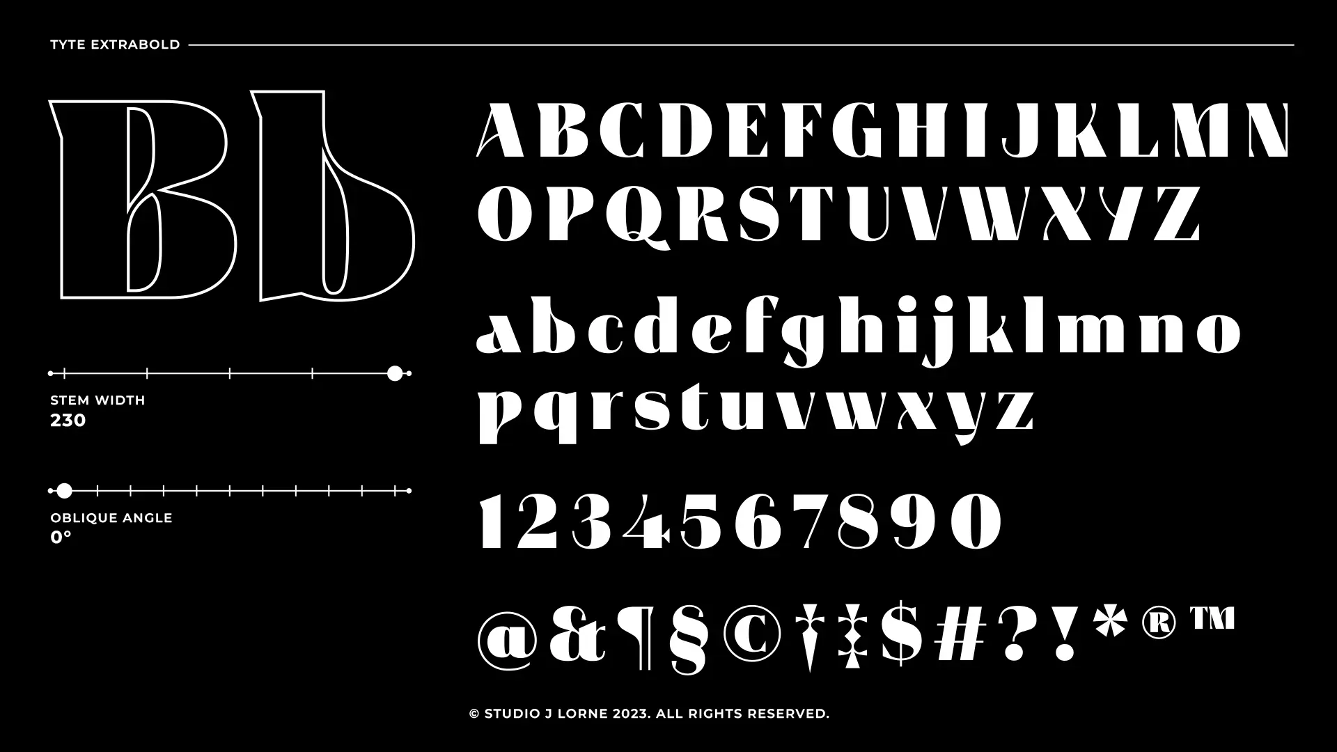
TYTE began as an all-caps display face, and the Sustainability Summit gave it its first commercial application. It is now a full family: A to Z upper and lower, numerals, punctuation, five weights from light through extra bold, and a set of obliques. Each summit gave us a reason to push it further, and by 2025 it could carry wayfinding at architectural scale, wall wraps and merchandise without borrowing from anything else. There are swashes and bespoke symbols too, including a section mark built from two stacked S's.
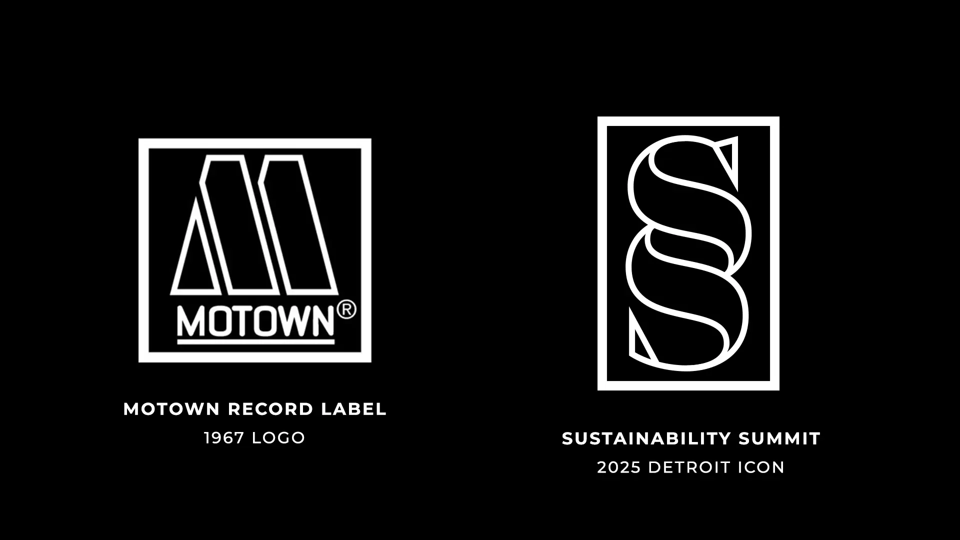
The face was drawn in Miami and it shows: high-rise towers, jutting balconies, palm trees swaying in the letterforms. Moving to Detroit in 2025, we left the font alone out of respect for that history and went looking for new history instead, and the 1967 Motown record label gave it to us. The double-stacked S we built carries the same stencil logic as Motown's M without forcing the effect. These are social enterprises, and their marks should look like the people they represent.
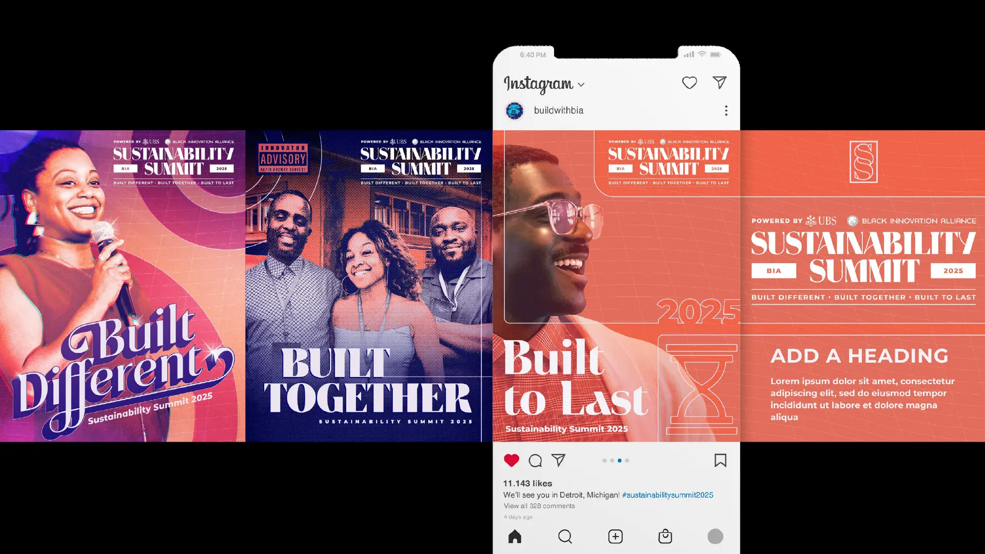
Ifeoma Ike of Pink Cornrows gave the year its theme: Built Different, Built Together, Built to Last. Three ideas in one line is a lot of tagline, so instead of shortening it we gave each part its own panel and its own era of Detroit music. Built Different is Motown, rings and gradients with the sparkle brought back and given a contemporary finish. Built Together is the city's nineties hip hop. Built to Last looks forward, a warm vision of a Detroit still to come. Together they run past to future, and every face in them is a BIA team member rather than a stock model.
“Working with SJL for the 2025 Sustainability Summit was an incredible experience! They walked alongside me to execute a carefully crafted summit experience. Throughout the planning process, they supported me by offering strategic thought leadership on experiential touchpoints for guests, partners, speakers and external stakeholders. We could not have produced a high-level summit experience without SJL!”