

HBCU Empower is the annual summit of the Howard University and PNC National Center for Entrepreneurship, held at the Westin in Washington DC in June 2026. It ran for years as the Black Commerce Conference and took its current name in 2025, a change made to protect the people and programs it serves, which left Studio J Lorne one month to brand the second edition under that name across environmental graphics, wayfinding, stage, print and social.
A month is not enough time to start over, and starting over was not the right instinct anyway, because the brand already worked. What it needed was a reason to look new and a sharper account of what the summit actually does, for two audiences at once. PNC and the stakeholders funding this needed to see that the impact was real and continuing, because proving the good you have already done is how you earn the room to do more. Everyone else, the Howard students and alumni, the speakers, the pitch competition finalists, needed to walk in, feel like they belonged there, and want to say so out loud.
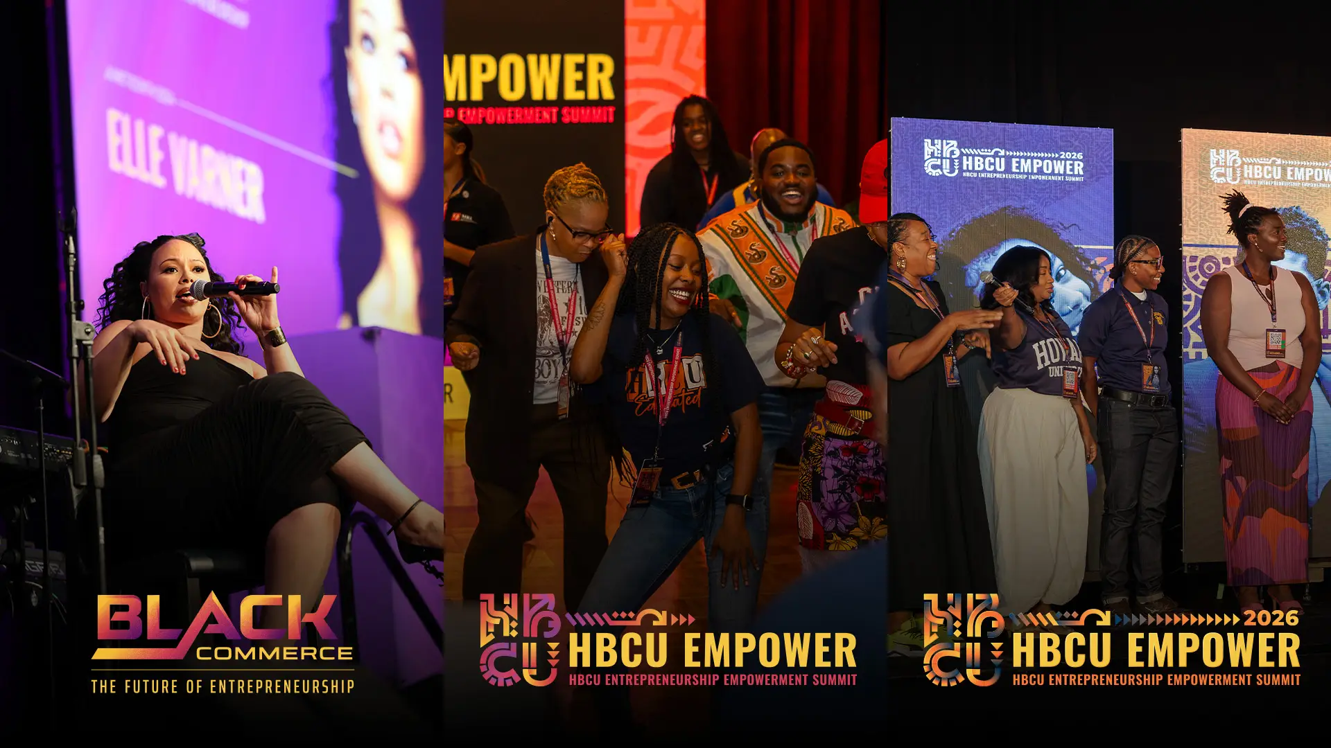
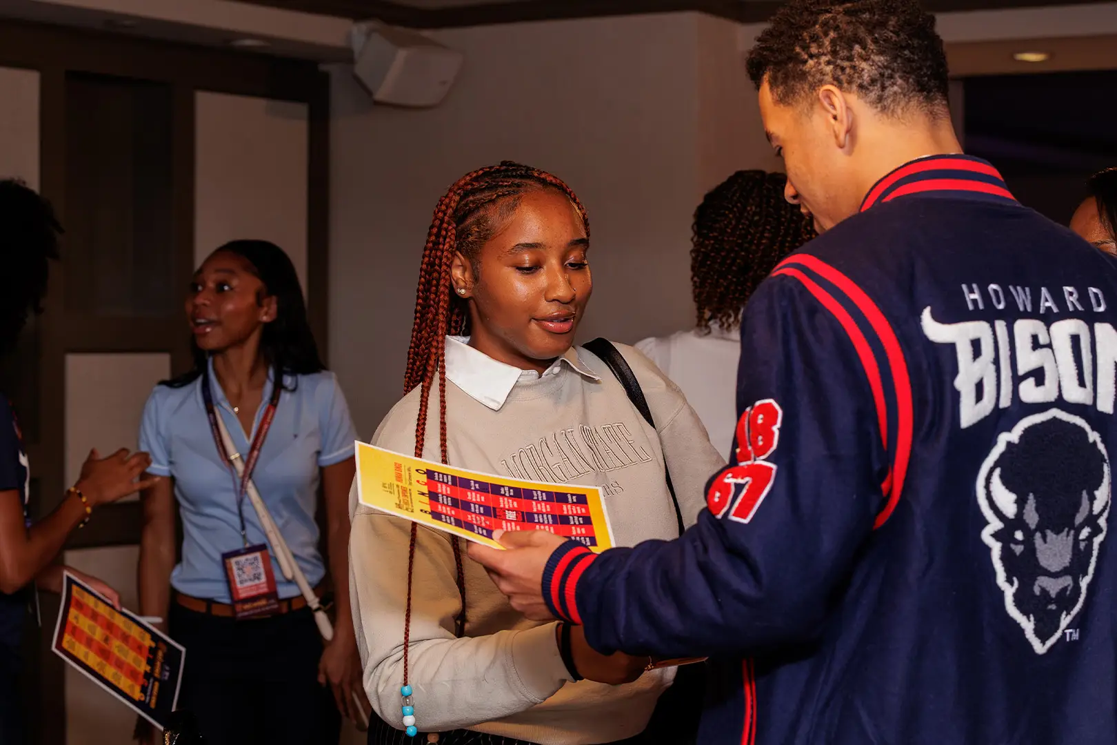
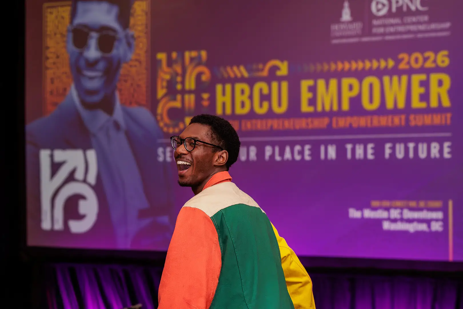
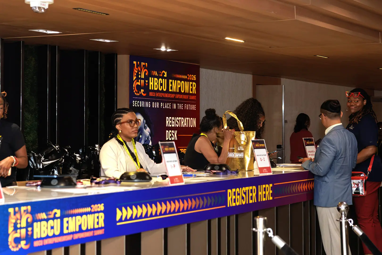
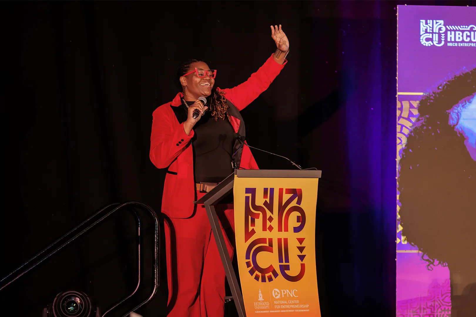
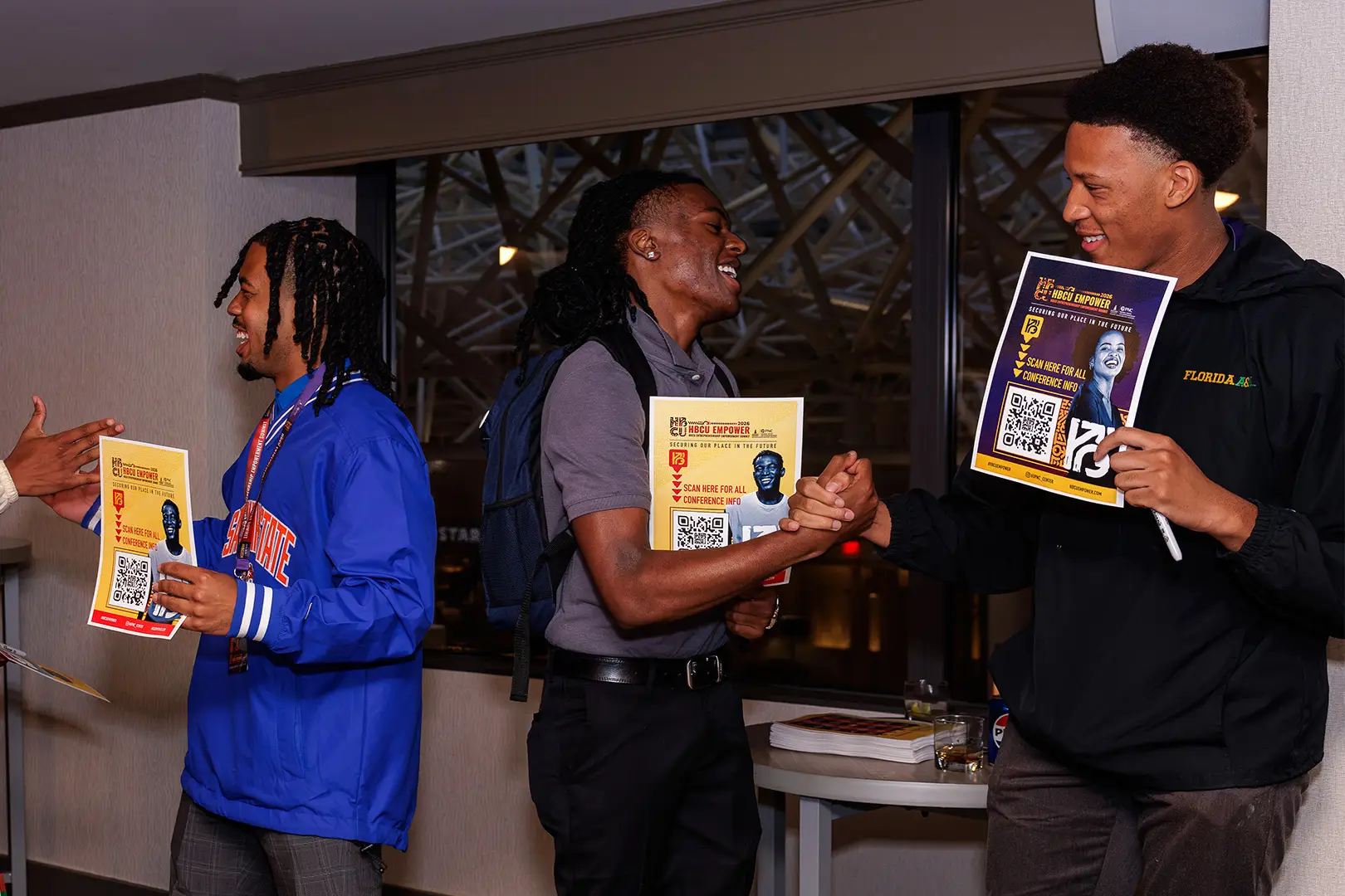
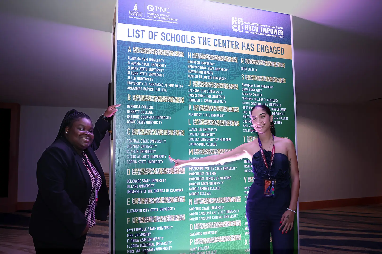
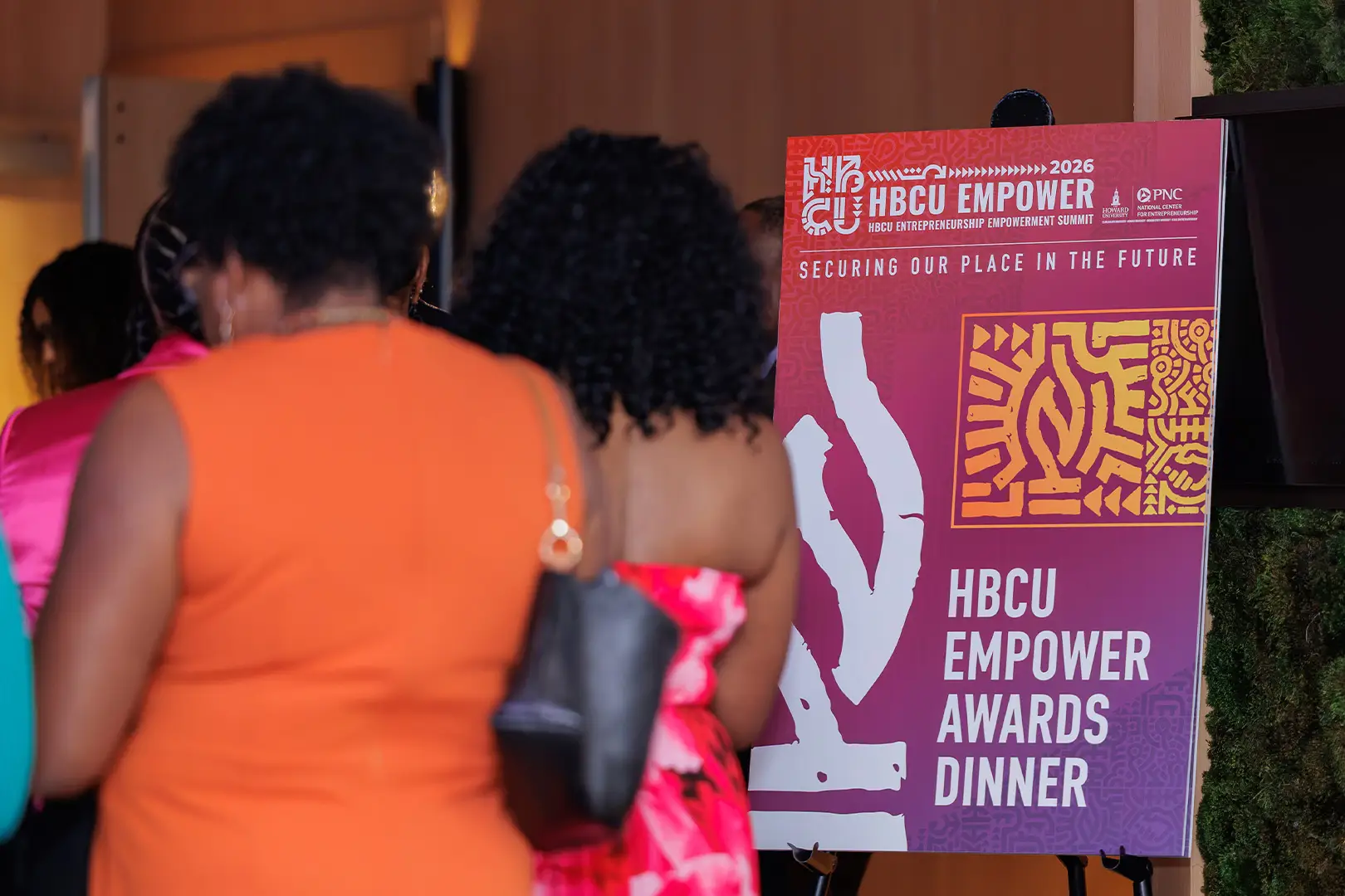
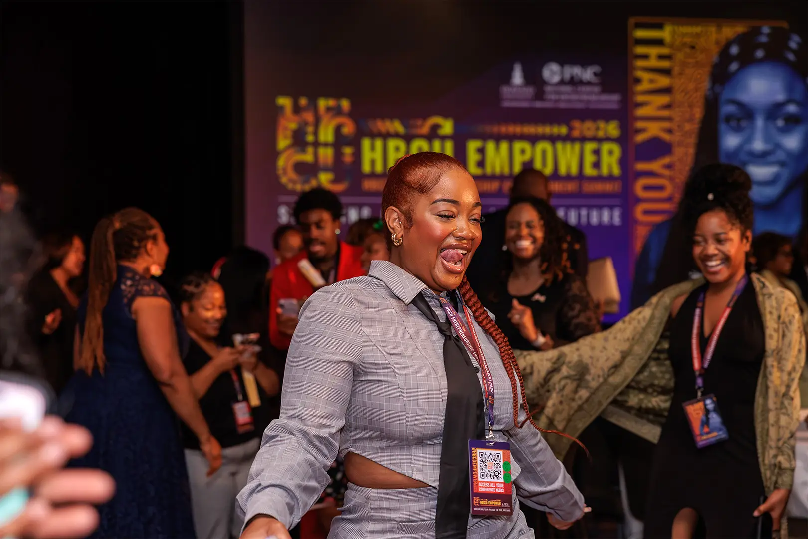
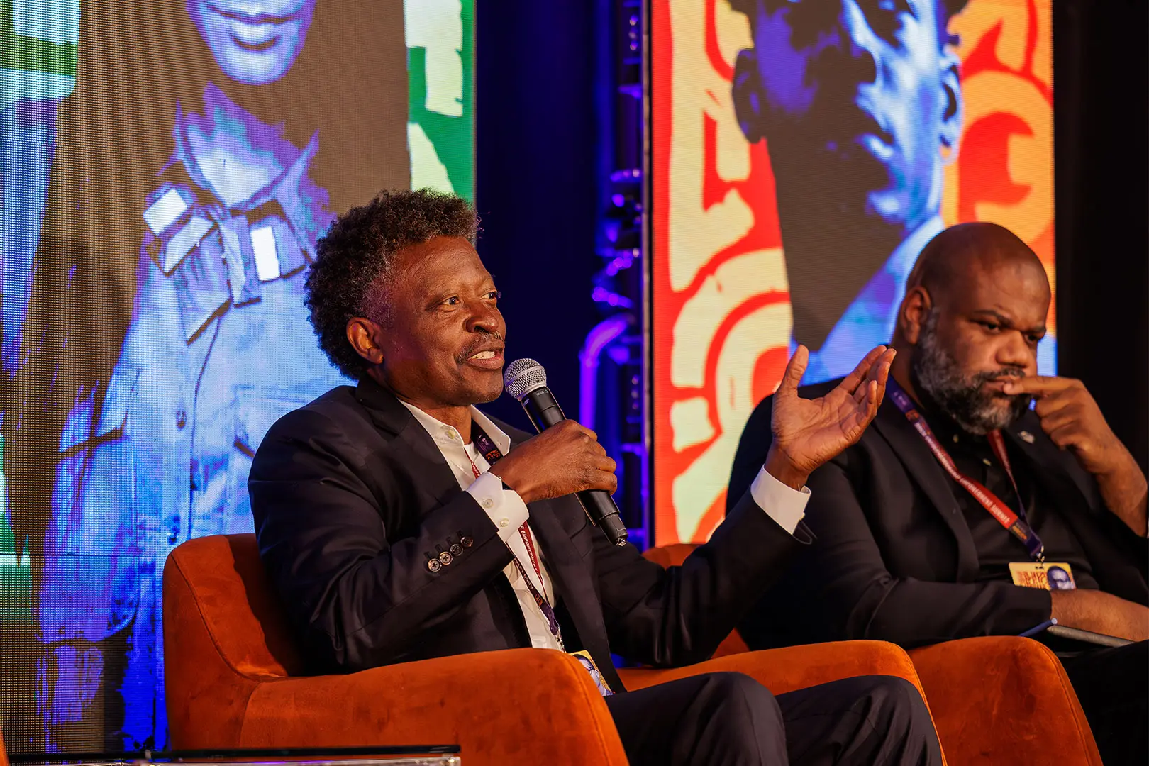
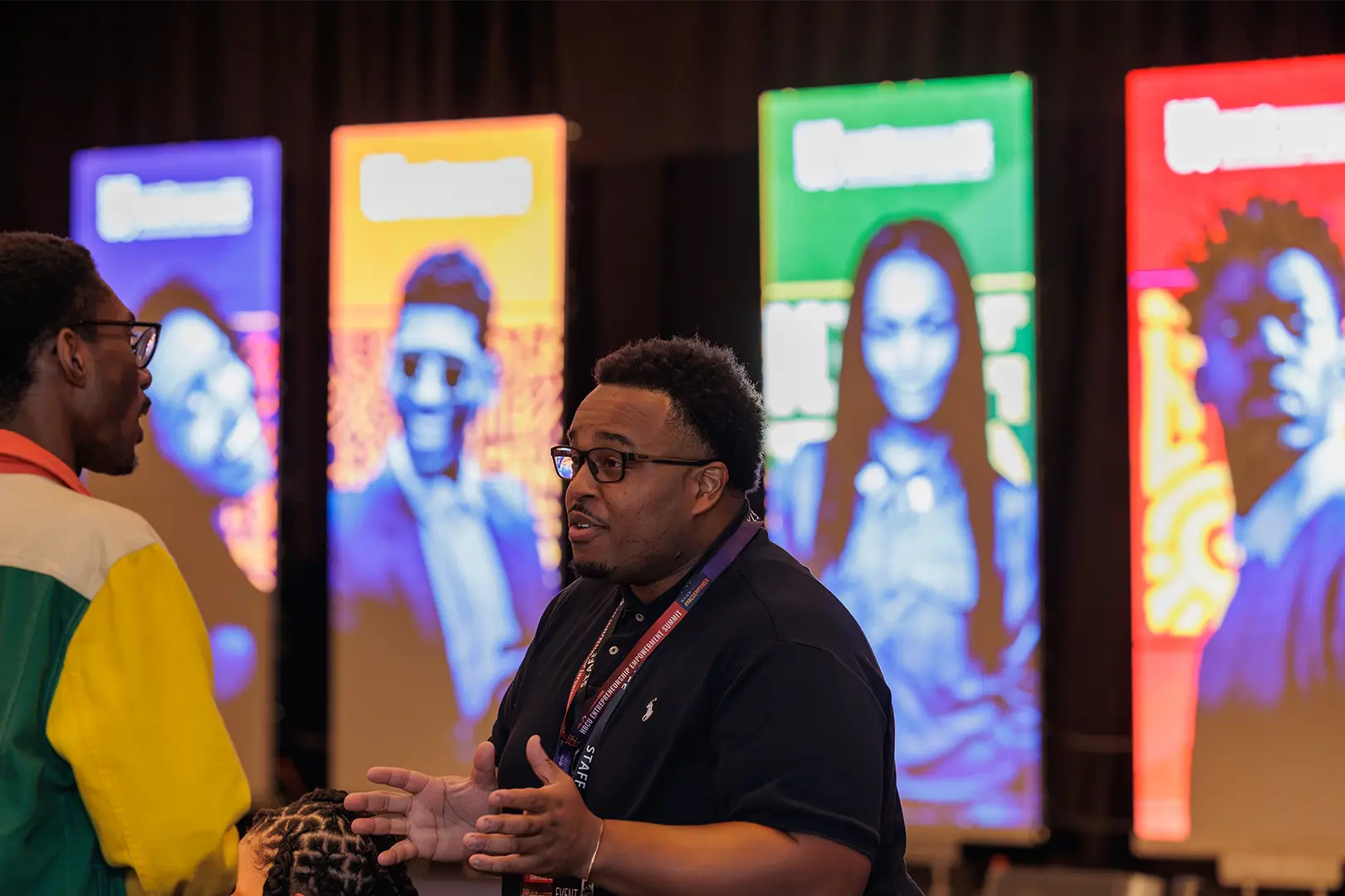
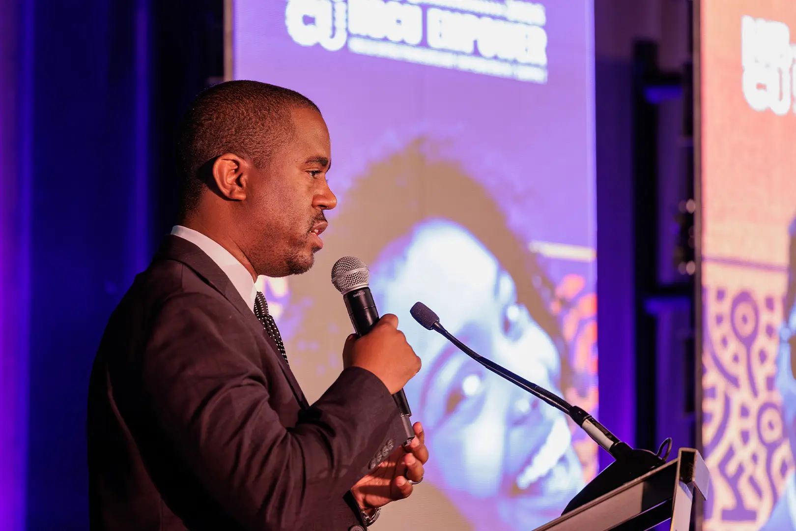
We built on the existing system rather than replacing it, then went looking for the places worth pushing. The palette kept two of its own colours and borrowed the rest from the schools in the program, while the sigils, which had lived as decorative texture, got pulled apart so individual marks could do real work. Environmental graphics went up across thirteen spaces in the hotel, with Four Deep running production and JT Logan’s team turning files into a built environment, so our job was to hand them everything clean: stage graphics, wayfinding, digital slides, handouts. The space was shared that week with another conference carrying roughly the same volume of signage, and ours read better, because it was made for the people walking through it rather than at them. Jason also spoke, a talk called Code Switching the Code, and both Dr. White and Dr. Graham named the work from the stage.
One month, built on a system that already worked.
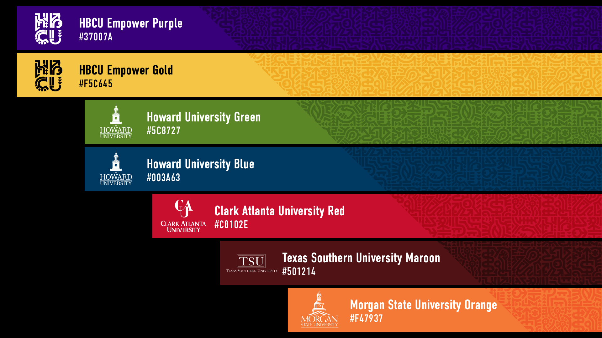
Two colours stayed, HBCU Empower purple and gold, and everything else came from the schools whose centres run in the program, one institutional colour each. Howard contributed green and blue, Clark Atlanta its red, Morgan State its orange. Every addition is a real school colour rather than something chosen to fill a swatch, so the palette carries the partnership inside it and the event got brighter without the brand drifting anywhere.
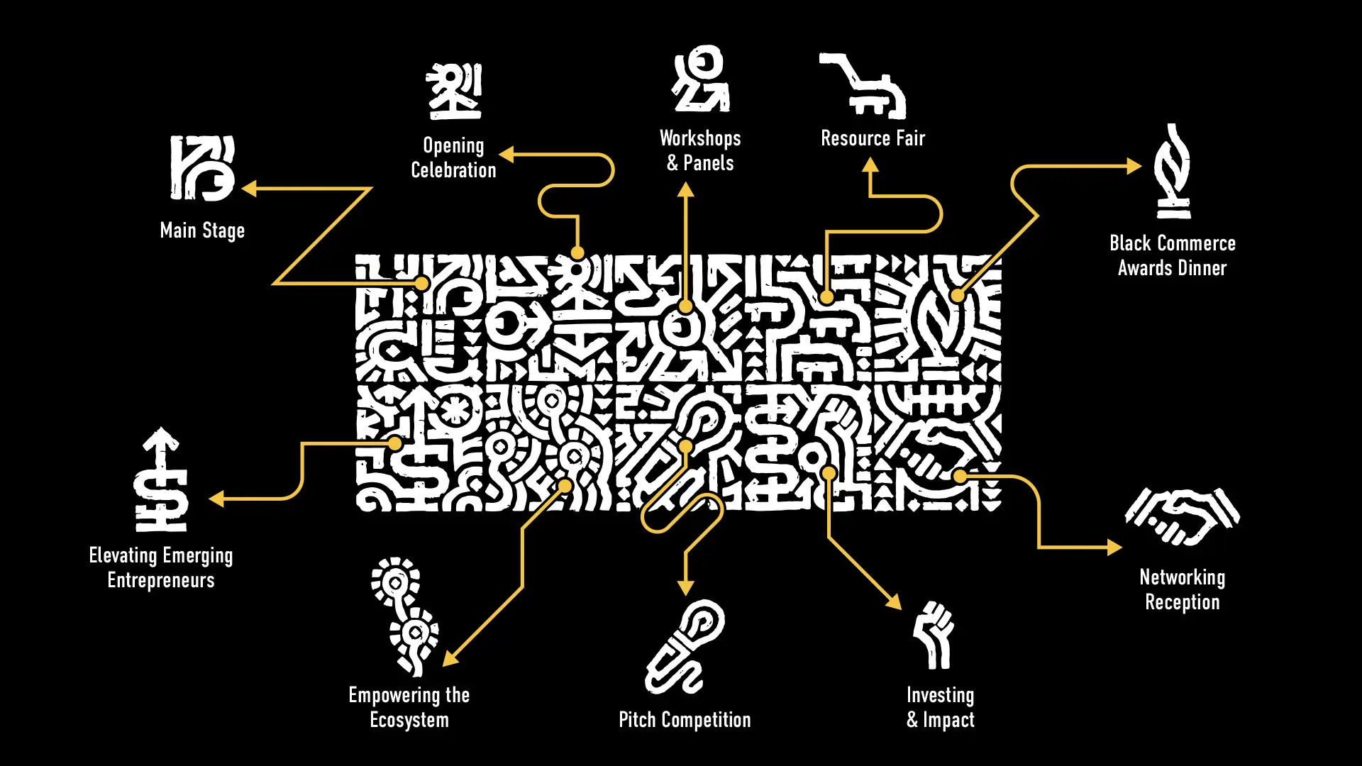
The sigil system already existed, but it lived as texture, so this year we lifted individual marks out of the pattern and gave each one a job: main stage, opening celebration, workshops and panels, resource fair, the awards dinner. Two are new, drawn for the networking reception and the pitch competition because those programs had grown enough to deserve their own marks. Extracted and labelled, the set stops being decoration and starts telling people where they are.
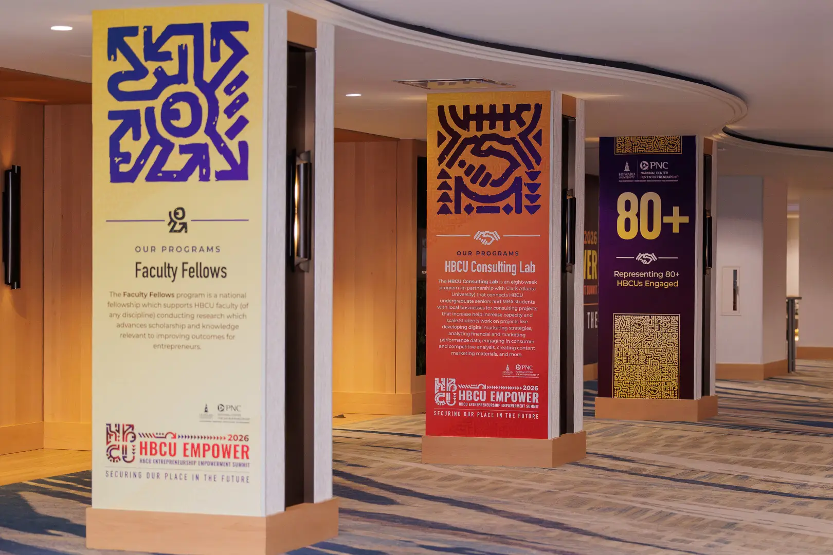
Hotel ballrooms come with columns, and most events treat them as obstacles to design around. We wrapped them in impact numbers and program descriptions instead, so the case for the summit was standing in the room with the people it needed to convince, and you could learn what the centre had done without sitting through a single session. It also put the stats somewhere a phone camera would find them, which is how impact travels now.
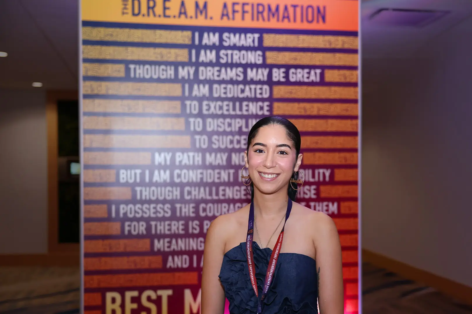
Dr. Graham wrote a D.R.E.A.M. affirmation more than a decade ago and has used it in classrooms and from stages ever since. He wanted it at the summit, so we gave it a treatment of its own and ran it across one of the larger walls, where it opens on being smart and being strong and does not get quieter from there. At that scale it stops being a line in a deck and becomes something people stood in front of and photographed.
“I've been to the conferences the past few years and this one raised the bar for the stellar branding and visuals.”