Black Innovation Alliance runs an ecosystem, not a product line. Three tools had to feel like they came from the same place without pretending to do the same job. We treated them as rooms in one building: shared language, shared behavior, a shared sense of who is being served, and enough distinction that nobody confuses the directory for the dashboard.
The brief was never really three products. It was one question asked three ways: what does it feel like to be taken seriously by software. Everything downstream, the type, the density, the way a screen greets you, traces back to that. If a founder opens any of these and feels like the tool was built for someone else, the system failed regardless of how well any single screen performs.
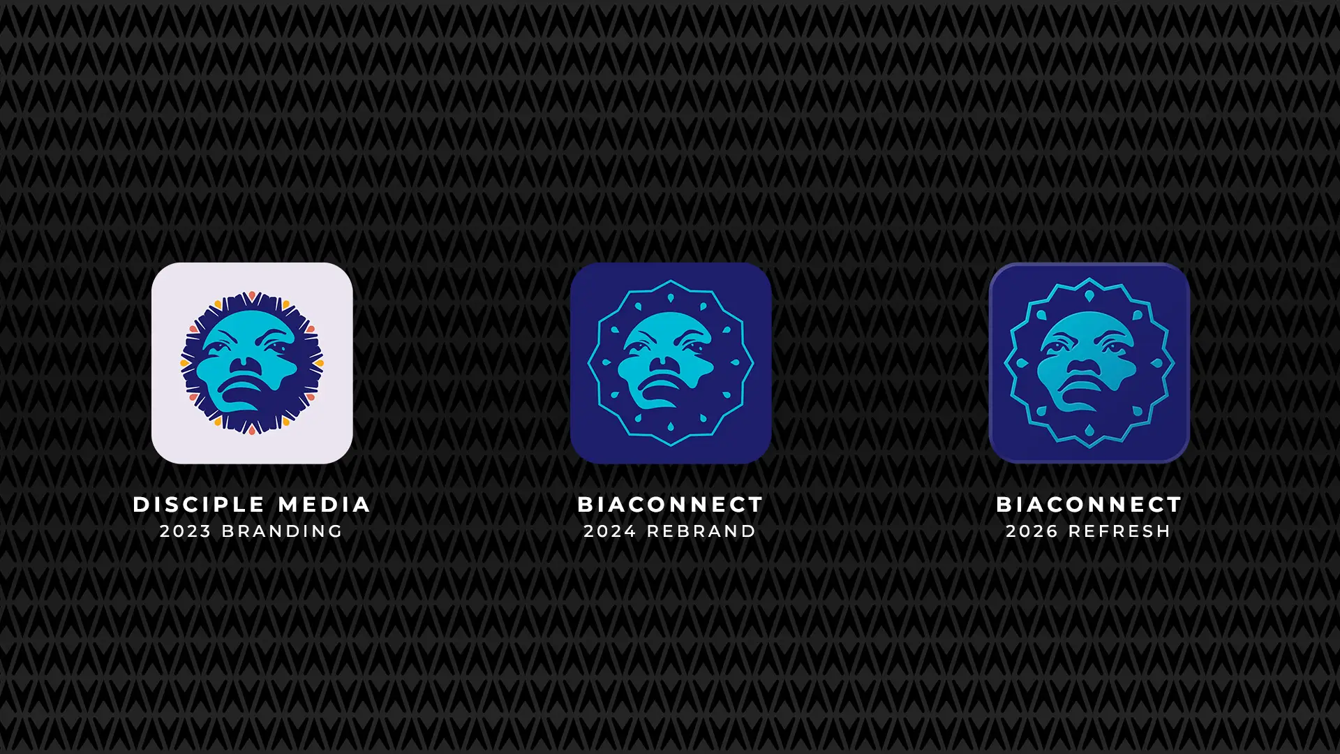
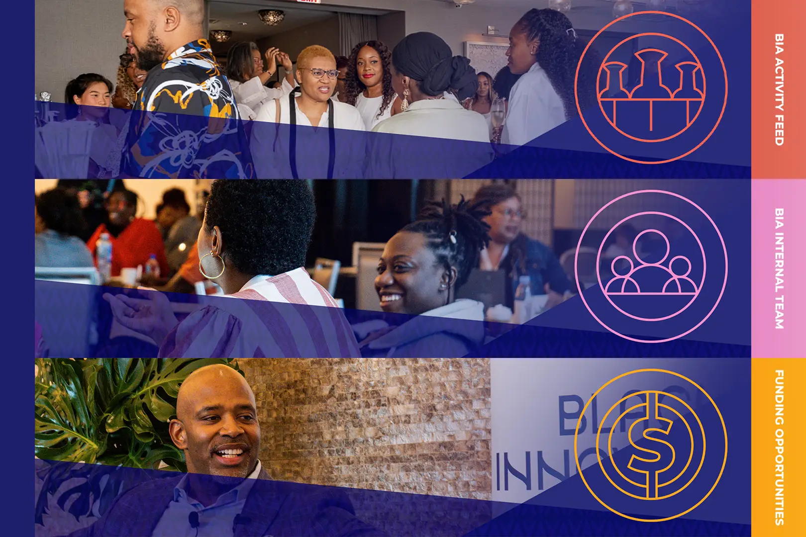
Another BIA team was building the app; we were asked for the graphics. The first real work was categorisation, sorting a loose request list into an icon system with an internal logic, so the set would read as a family rather than a collection. The look leans Afrofuturist, high-gloss and linear, drawn from icon work already in the BIA world and pushed somewhere brighter. We also made a BIA logo variant used only here, taking the face from the mark and bringing it into the same glowing line treatment. That was the point where BIA Connect started to feel like its own place rather than a section of something else.
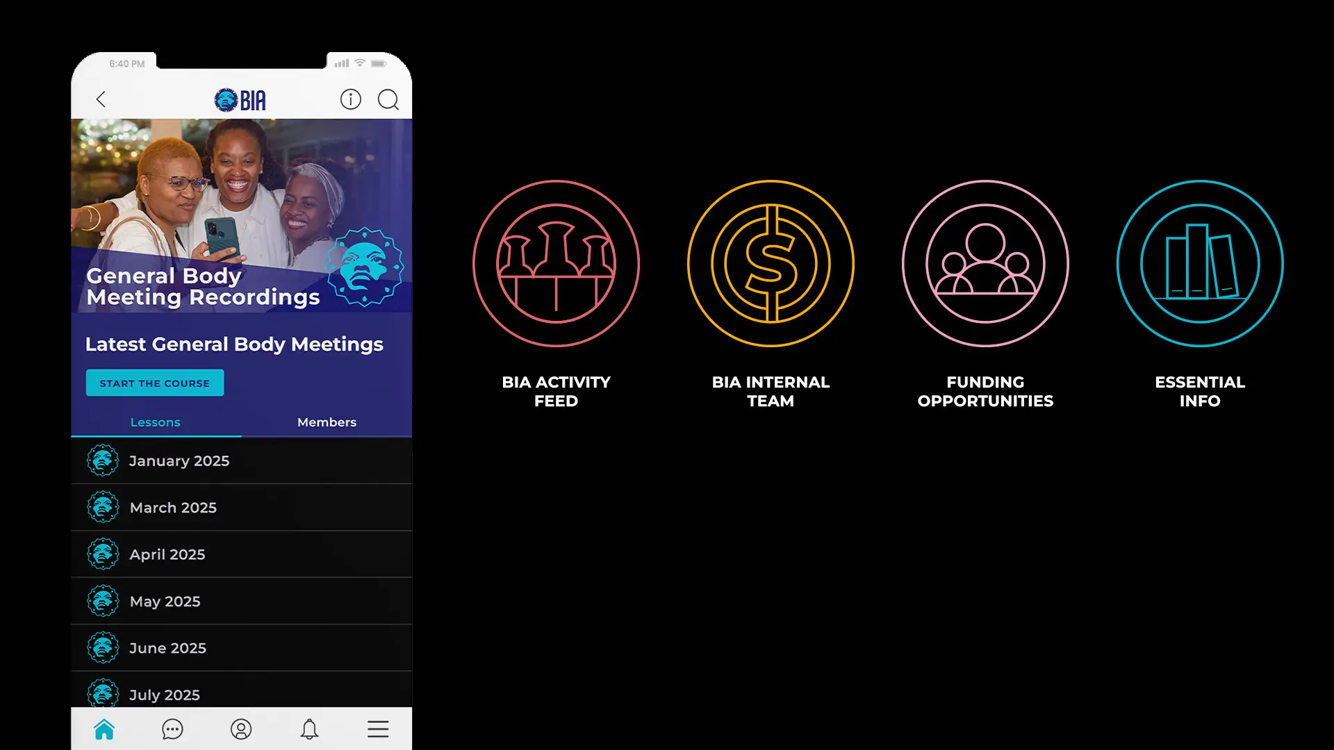
Four icons carry the app's main areas: activity feed, internal team, funding opportunities, essential info. Each is a single glowing line inside a ring, close enough to read as a set at a glance. The one worth stopping on is the activity feed, where the mark is a fine-tooth comb. It sits in the same visual language as the others and it is doing something else at the same time, which is the whole idea. Miss it and you miss it. It is there on purpose.
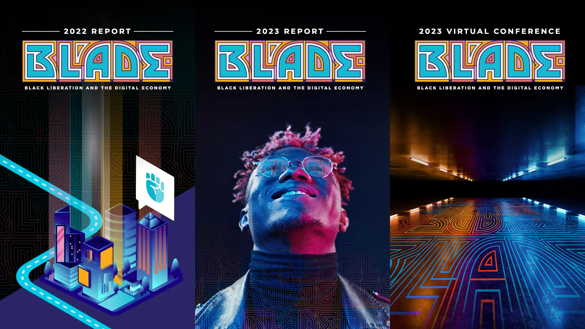
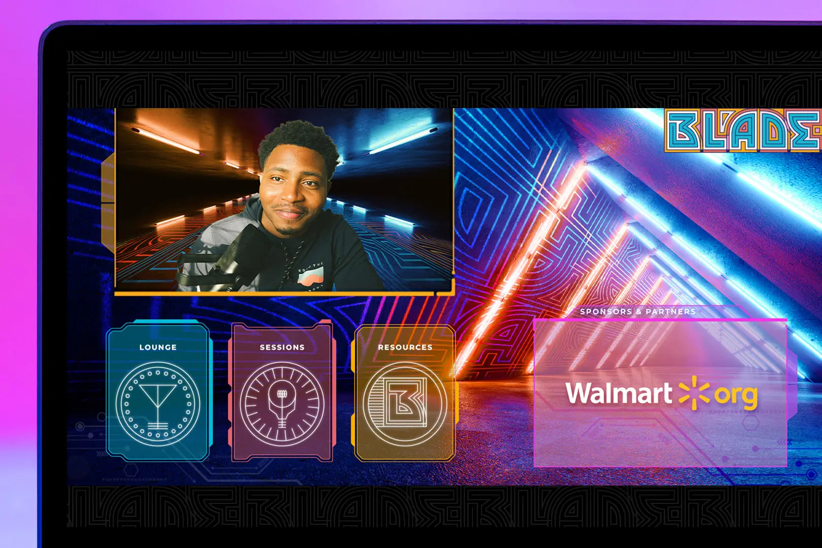
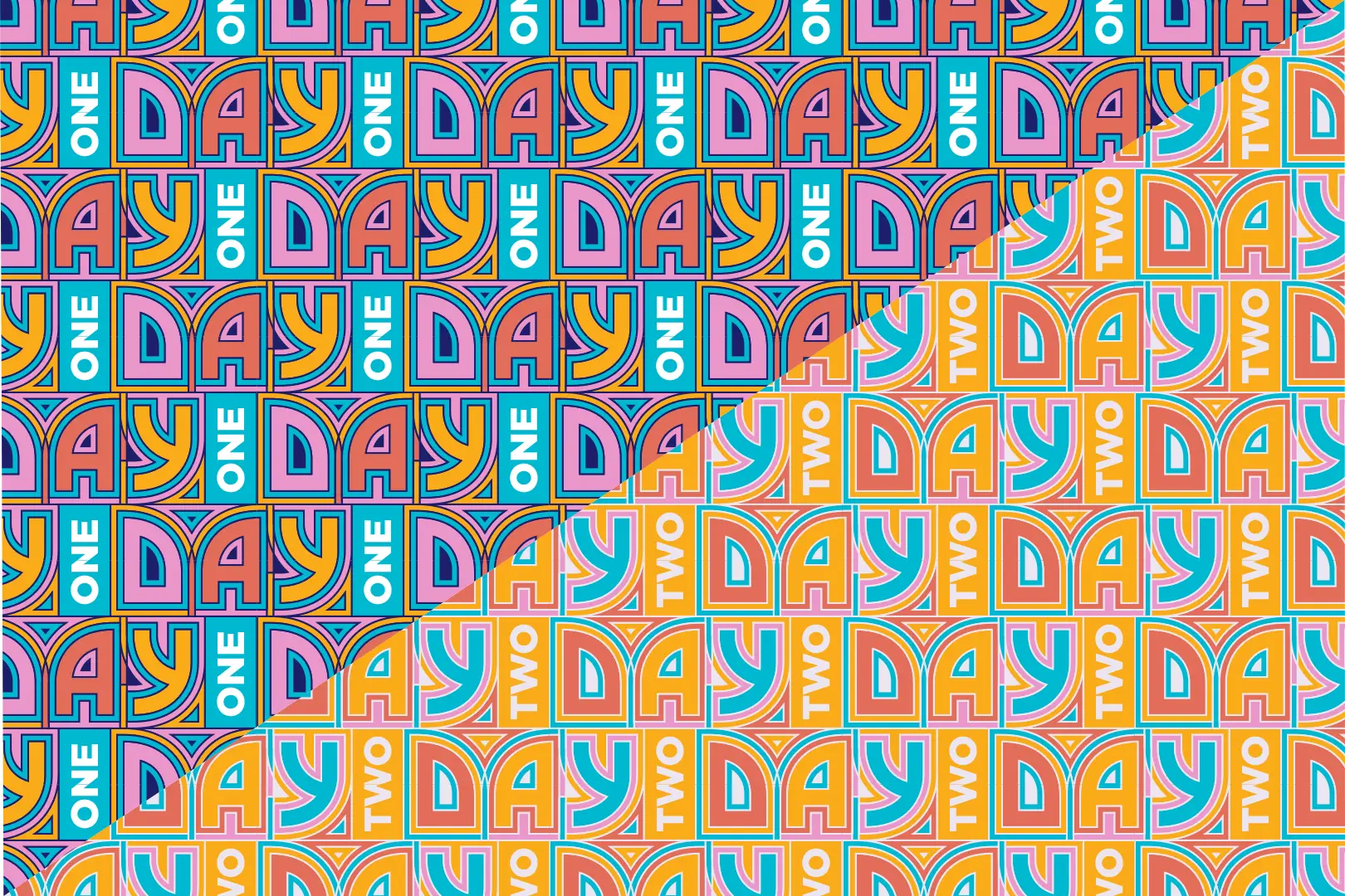
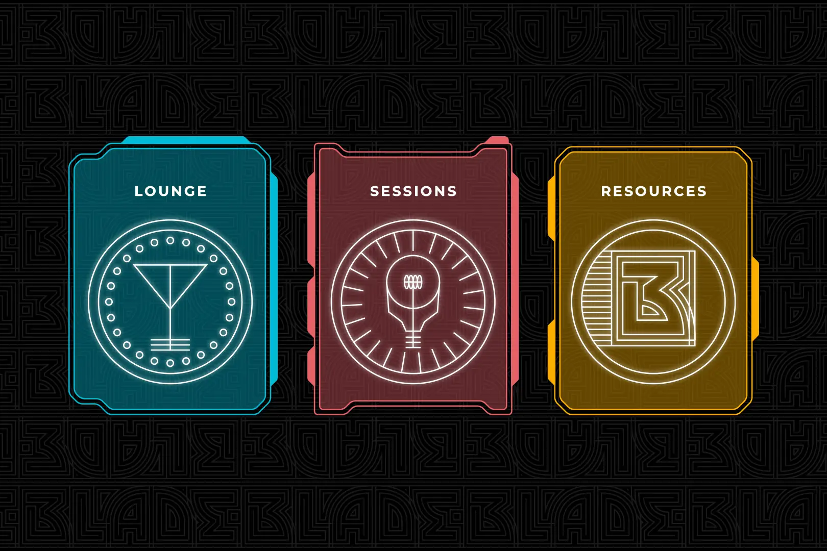
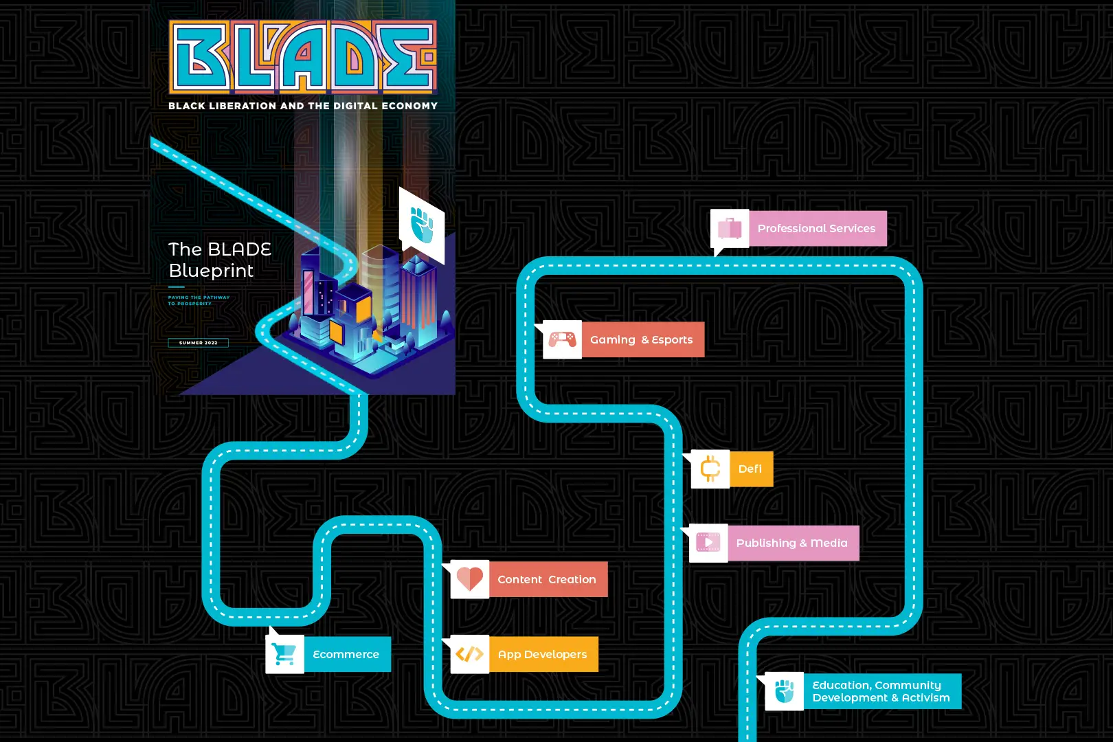
BLADE runs digitally, which removes the one thing a conference normally gives you: somewhere to stand. Our job was to make the space instead. The design leans on maps and territory, treating sectors as places you can walk between rather than sessions in a list, and lets symbols and colour do the wayfinding that signage would do in a venue. Credit for the blueprint illustration itself goes to other designers on the team. What we held onto across the work was that people arriving over a video call should still get the feeling of having gone somewhere.
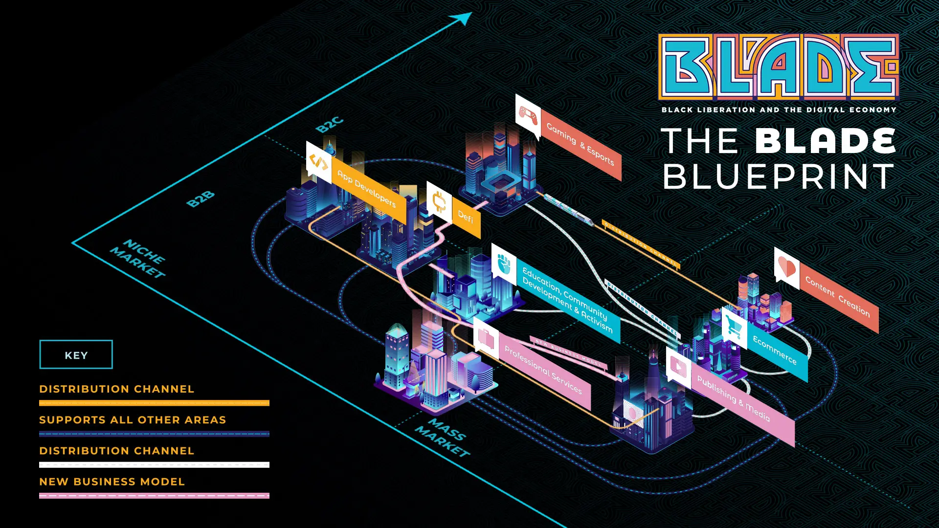
The BLADE Blueprint draws the Black digital economy as an isometric city. Each district is a sector, gaming and esports, content creation, ecommerce, professional services, publishing and media, and the whole grid sits on two axes: B2B to B2C across, niche to mass market down. Colour-coded routes run between them, marking distribution channels and new business models. It turns a strategy document into somewhere you can look for yourself rather than be walked through.
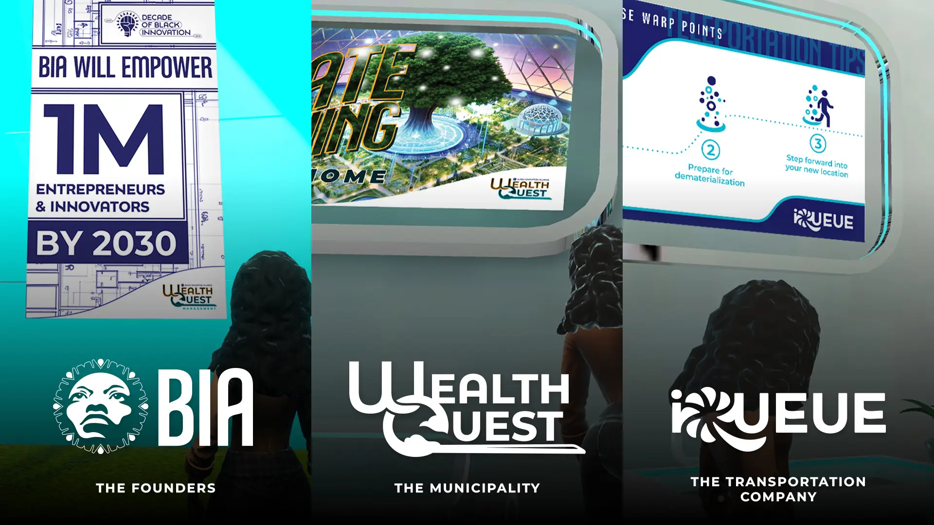
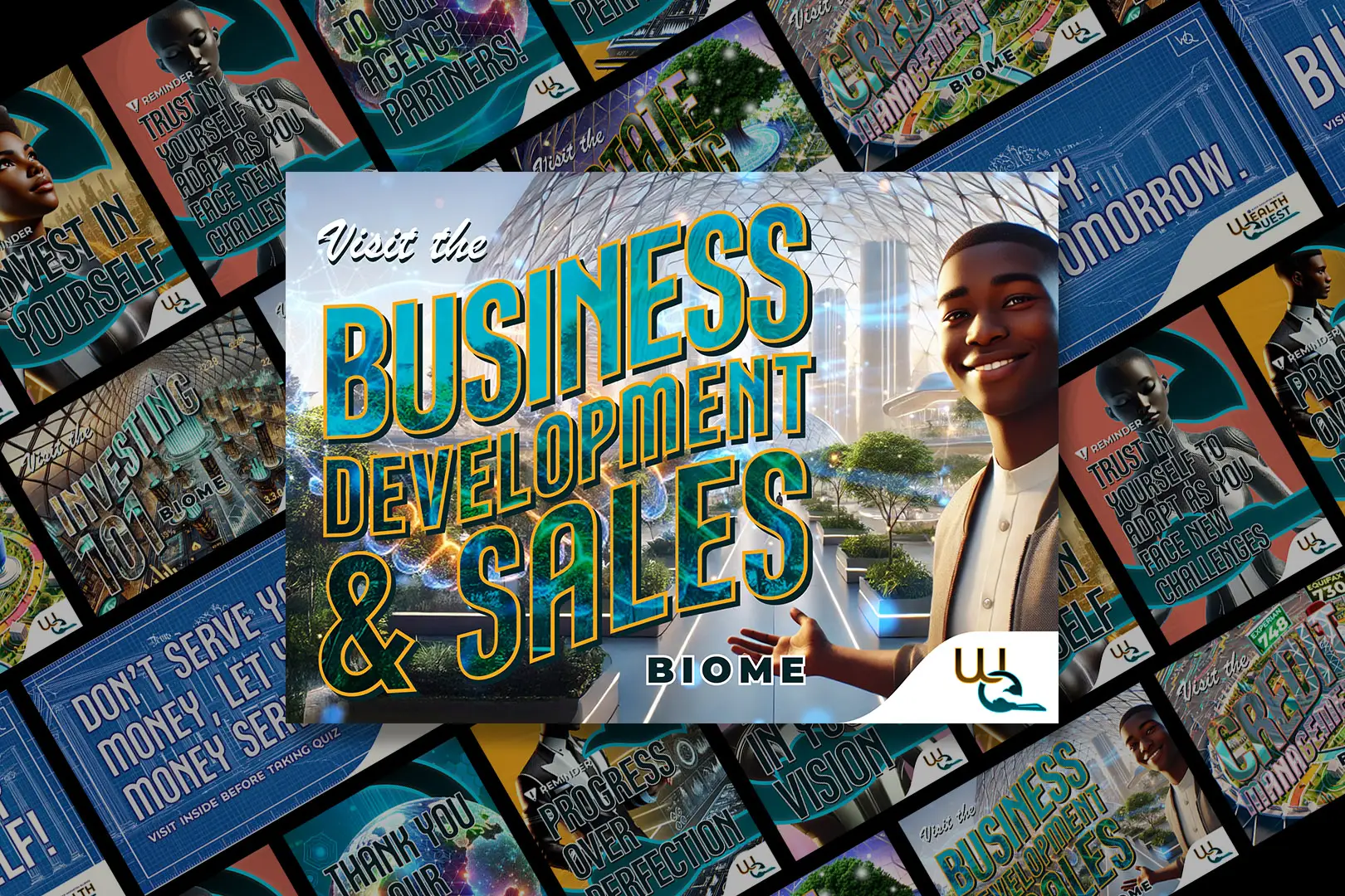
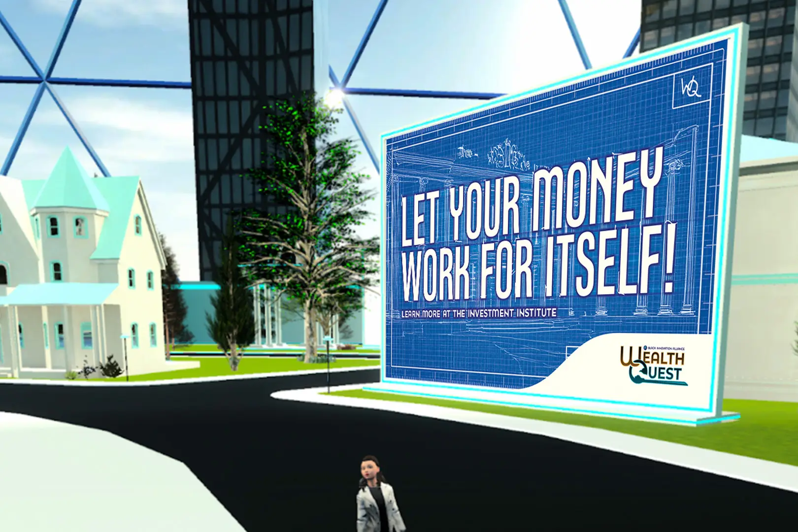
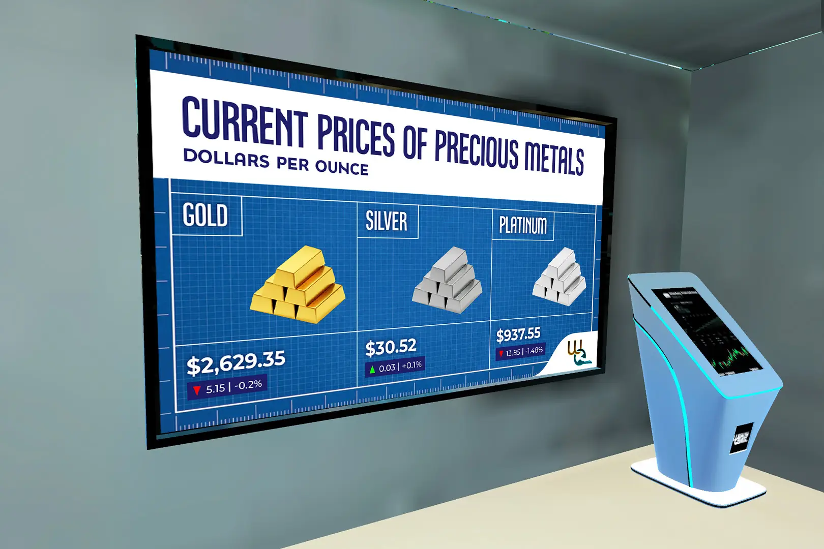
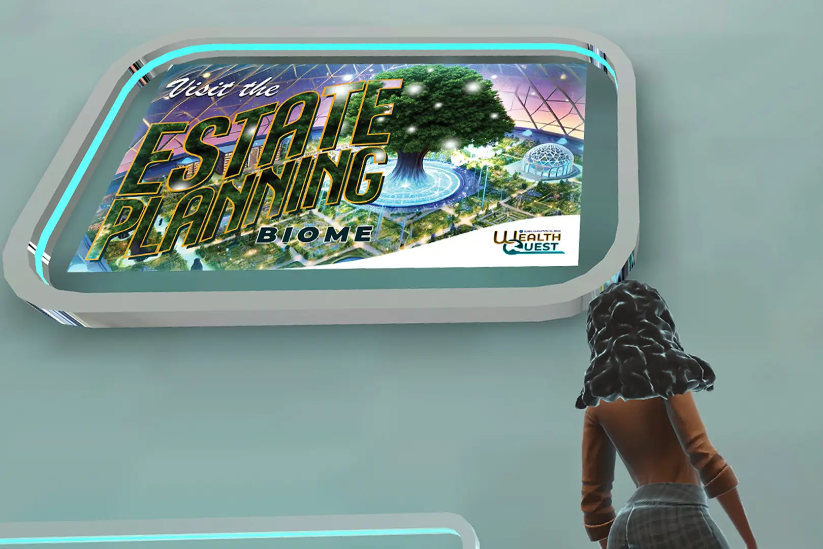
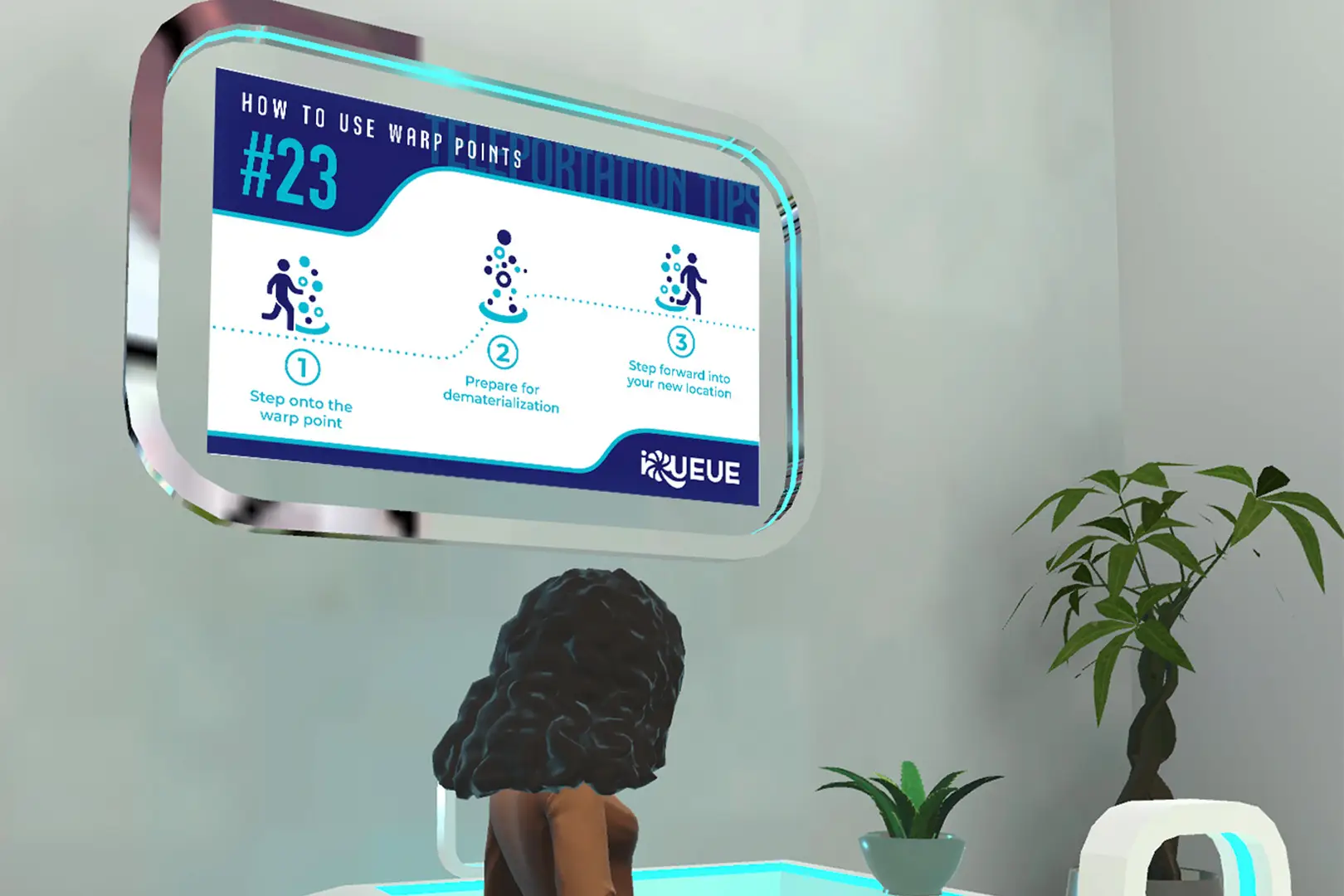
WealthQuest needed a voice of its own inside the BIA world, and we built it out of letterforms rather than layout. Two uppercase typefaces were drawn for it. Montzhuzh came out of the 2021 BIA logo, taking its proportions from Montserrat Alternates before going somewhere of its own, and now runs three weights. Clapback came out of a BIA campaign of the same name and picked up the 2025 logo refresh along the way. Between them they cover the digital signage, the postcards, the posters and the titling, which meant the project never had to reach outside itself for type.
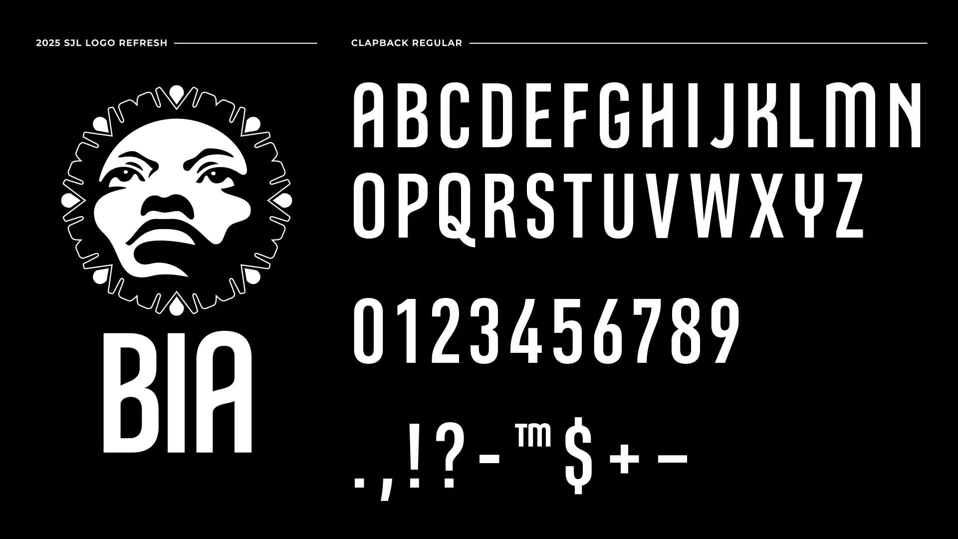
WealthQuest runs on two typefaces we drew ourselves, both uppercase only. Montzhuzh started from the 2021 BIA logo, taking its proportions from Montserrat Alternates before going its own way, and now runs a full uppercase alphabet in regular, medium and bold. Clapback is named after the BIA campaign it came from and carries the 2025 logo refresh. Condensed and bold, with a wavy connecting line running through most letters, it became the face of the digital signage, the postcards and the posters.

The playbook covers how we get from a brief to a system that holds up across more than one product.