
Black and Brown Founders launched Chroma in 2020 as a digital conference in the middle of the pandemic, and Aniyia Williams arrived with the beginnings of a brand already in hand: a name, a palette, gradients and a tagline. Studio J Lorne took that as a challenge rather than a constraint and built it into a system that carried all four editions, where each year looks like itself and still belongs to the ones before it. Chroma is named for the spectrum, and the identity was built to earn that name rather than decorate it.
To understand Chroma you have to understand who it was for. Venture money reaches a vanishingly small fraction of founders of color, so Chroma taught people how to venture anyway: how to build, find customers, and scale in a way that was fun, educational, and honest about the odds. The identity had to work the same way, generous and structured at once. If the name points at a spectrum, then colour itself can be the through line, with each edition handing one of its two colours forward to the next. That single rule does the work of a style guide, keeping four years legible as one project without freezing any of them.
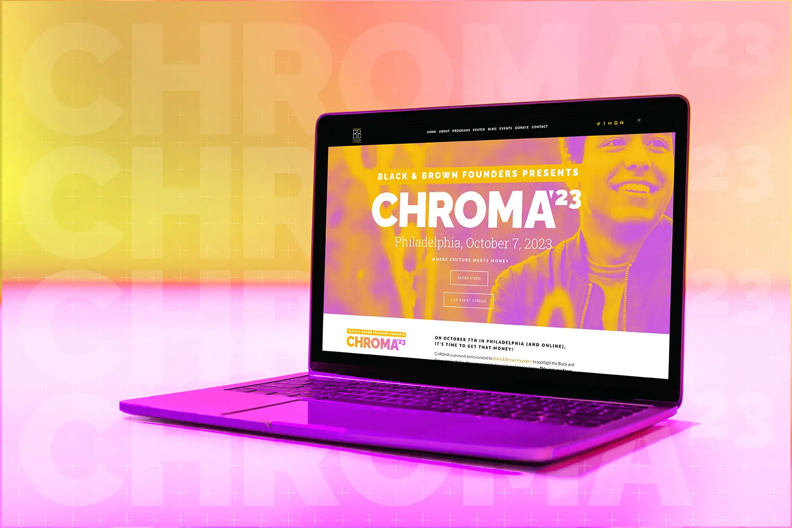
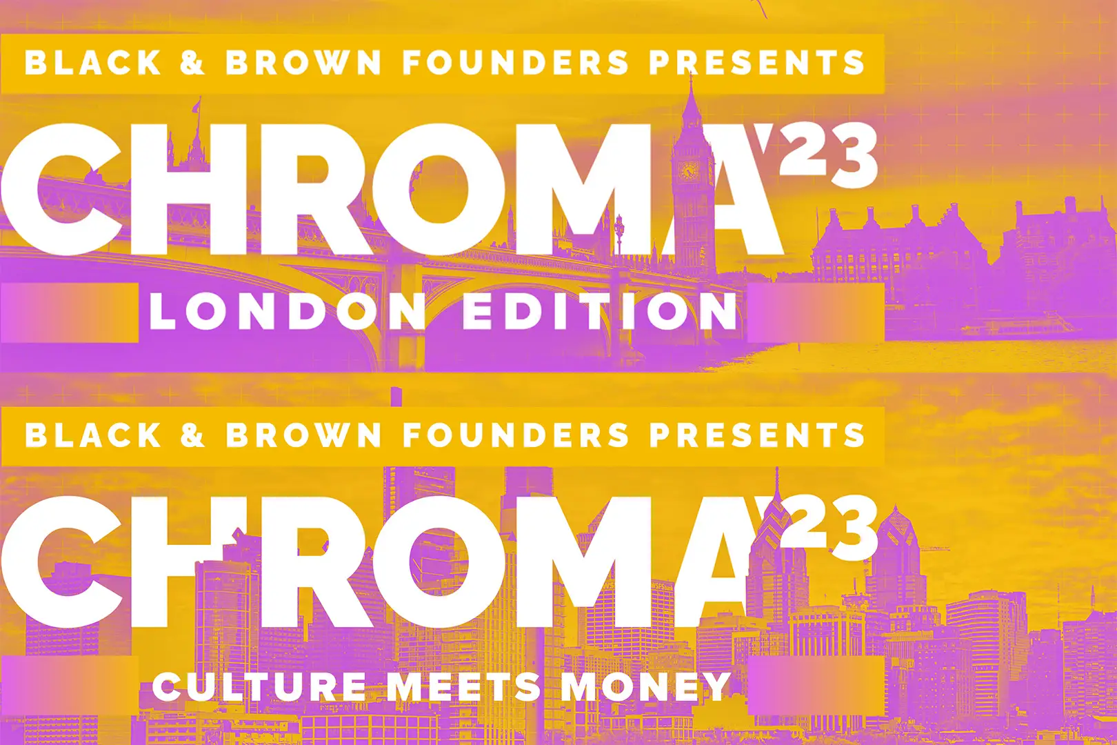
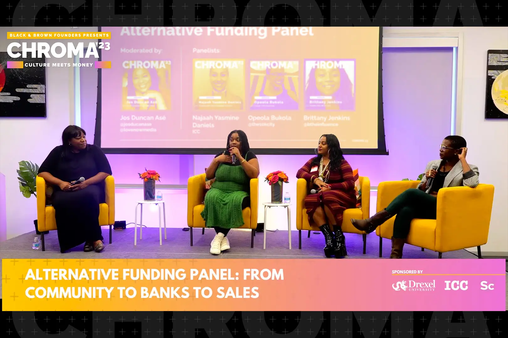
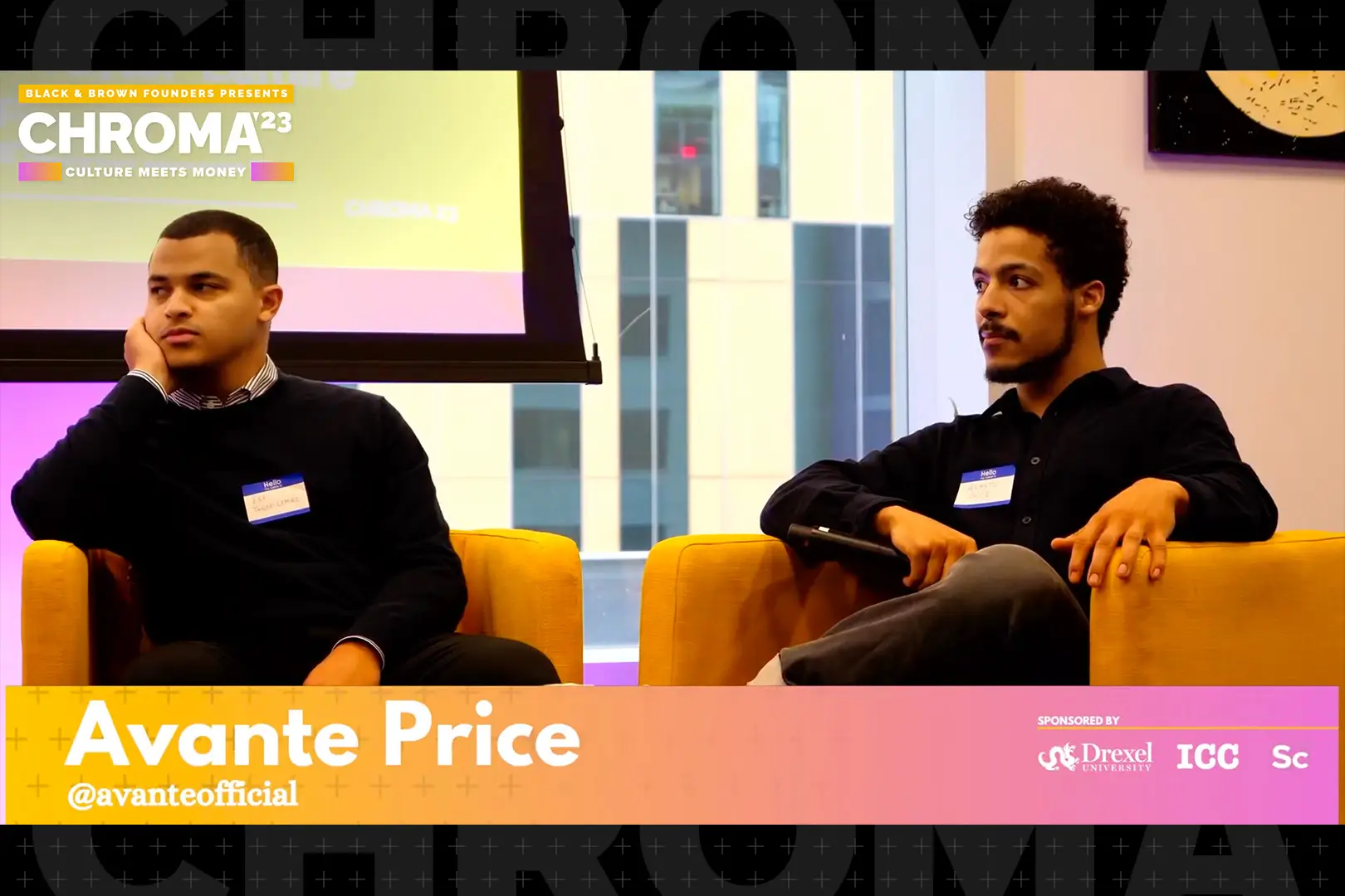
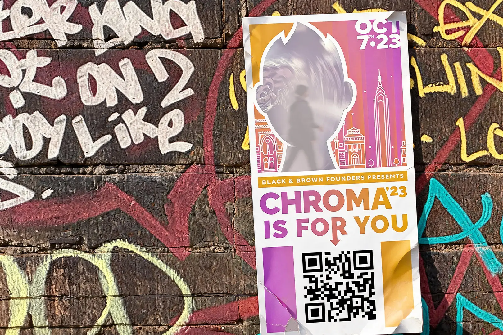

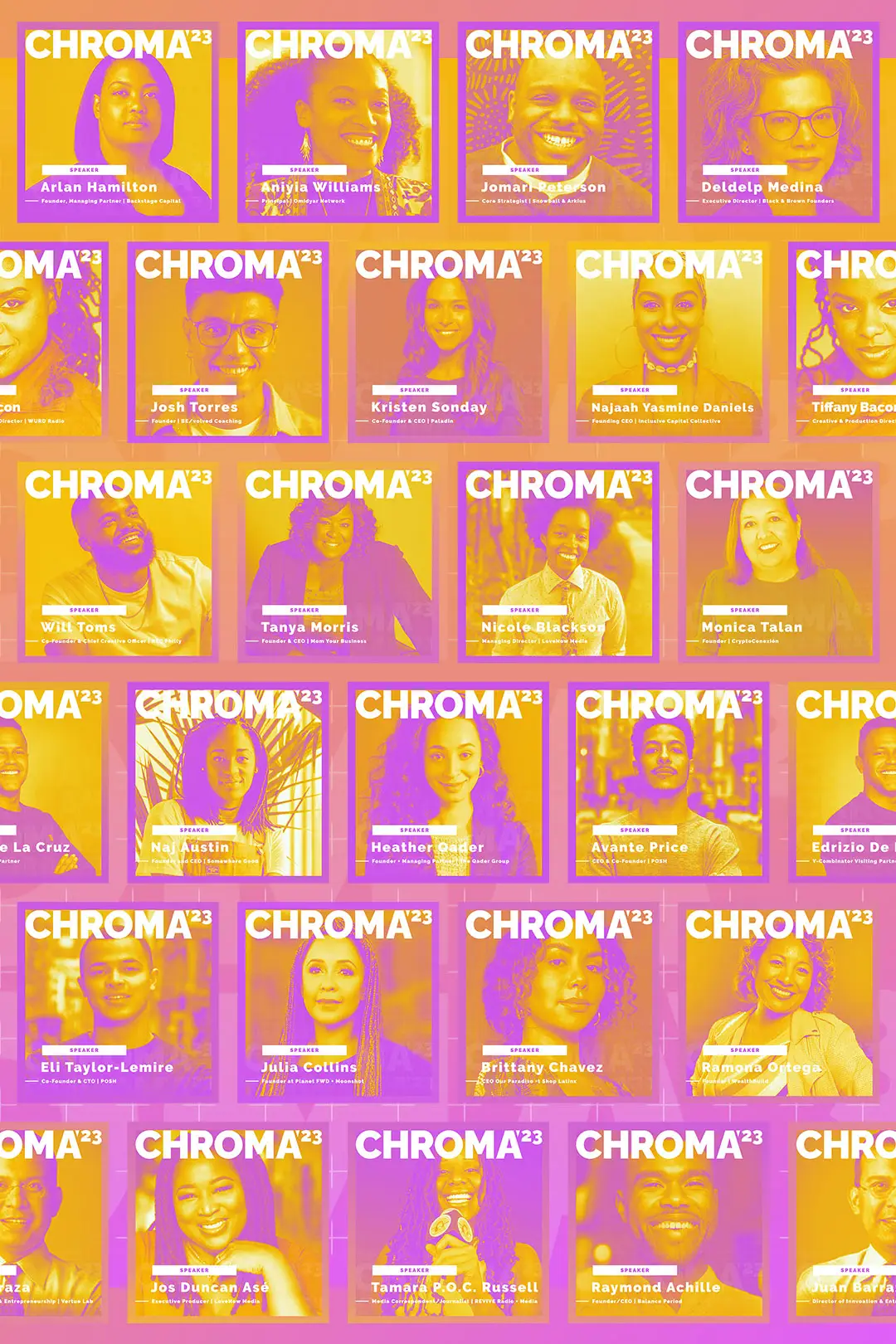
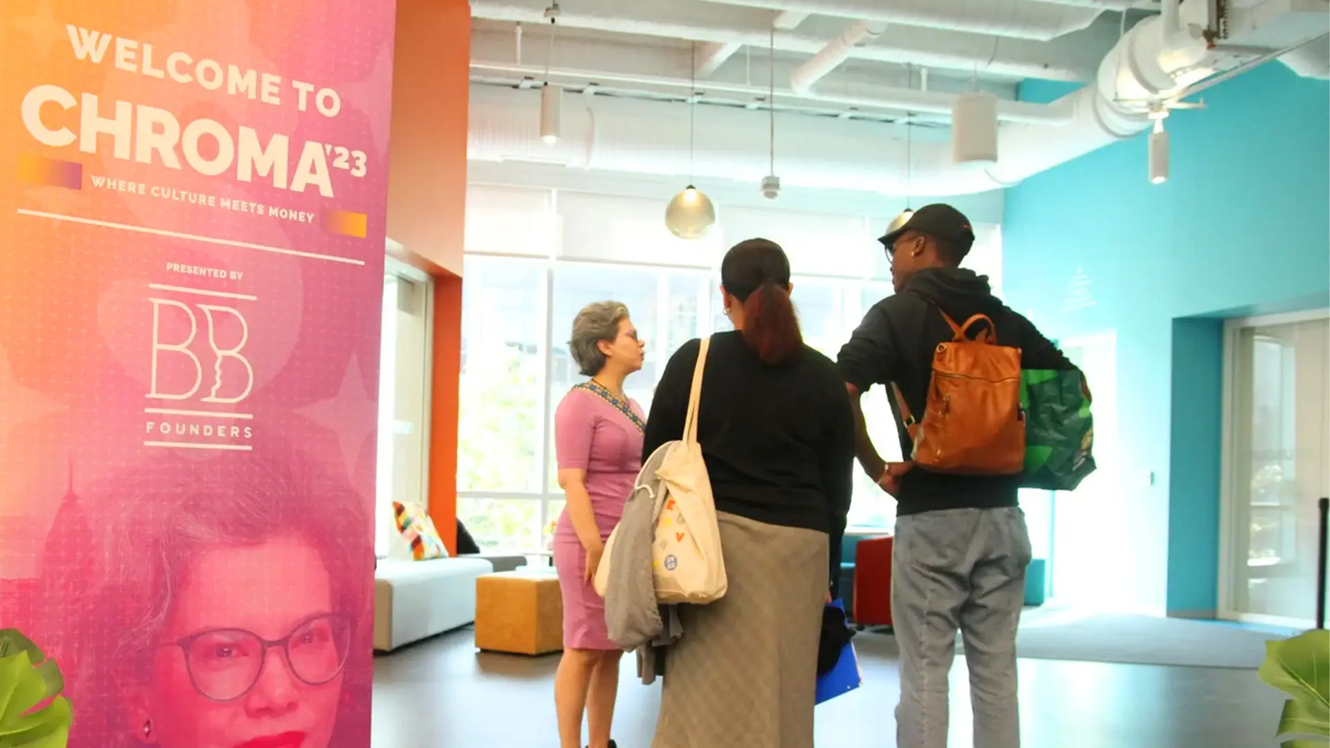
Chroma’s identity was built one year at a time, which is a different discipline from designing it all at once. Each edition starts from the colour it inherits, so the first decision is always what to pair with it, and that choice has to work twice: once for this year’s artwork and once as the seed for next year’s. The themes sharpened the same way, moving from Conversations, Connections, Capital to Get Your Money Right to Culture Meets Money, each year focusing the argument a little further. The 2023 edition put the whole system to work at the University City Science Center in Philadelphia. Because this is Black and Brown founders together, it is easy to index on one group, so we worked to strike the balance in the language as much as the visuals. Speaker templates were drawn rather than assembled and handed over as easy Canva files so speakers and announcers could build their own hype, the campaign ran bilingual by design, and guerrilla marketing tactics carried it into the streets.
Each year inherits a colour and passes one on.
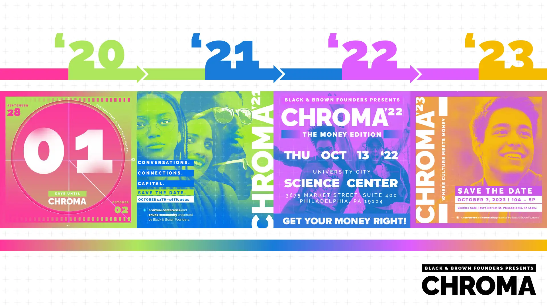
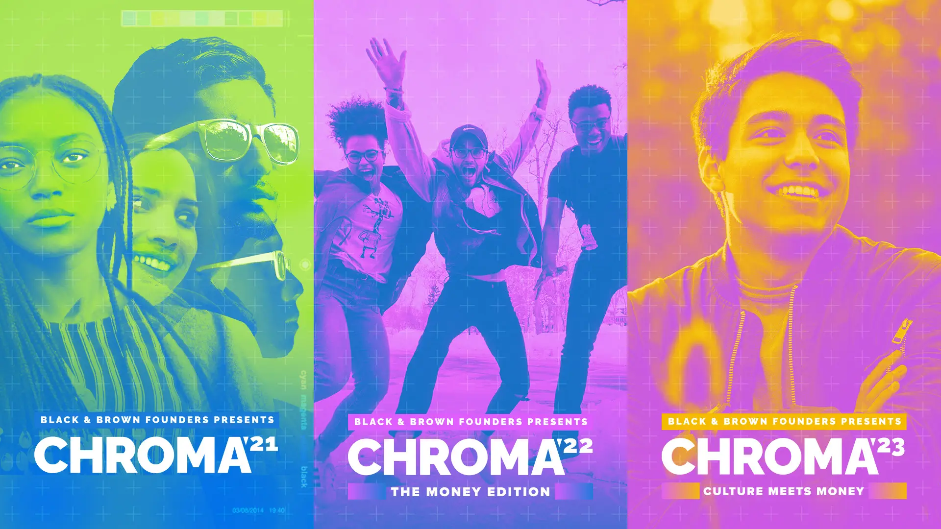
Chroma is named for the spectrum, so the identity had to earn it. Each edition runs two colours, and one of them carries forward into the next year. Laid out across 2020 to 2023 you can see the whole chain at once: green into blue, blue into violet, violet into a yellow orange. Four conferences that each look like themselves and still read as one continuous thing. It is a slow, deliberate way to build an identity, and it only works if you commit to it early.
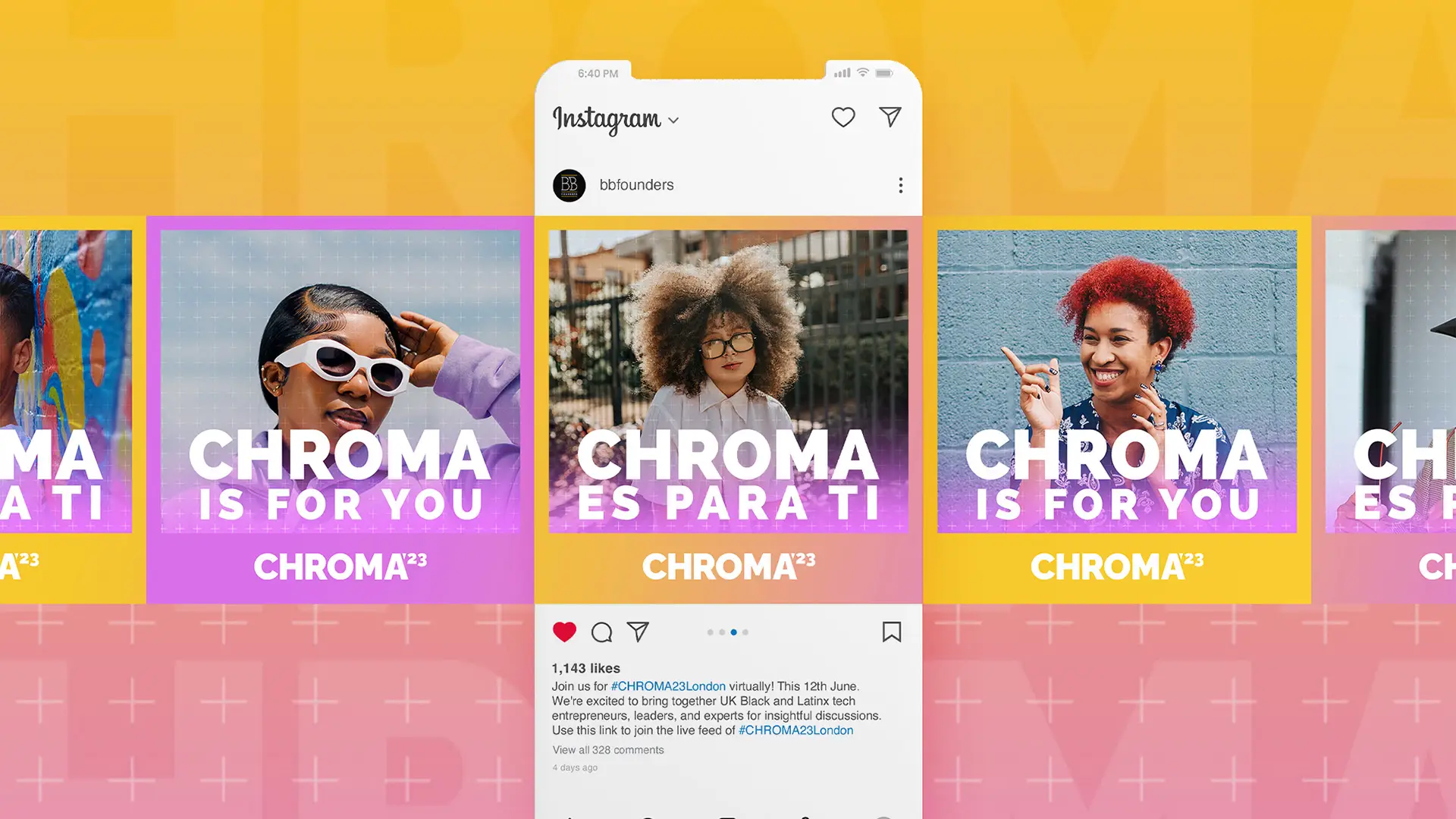
The 2023 social work covers speaker templates for Instagram, drawn rather than assembled, so we held full visual control over every frame instead of filling in a grid. Alongside them ran a simple series: Chroma is for you, and Chroma es para ti. The studio has had Spanish-speaking designers for most of its life, self-taught or through family, so bilingual work gets designed in both languages rather than translated into the second one. That is rarer than it should be.
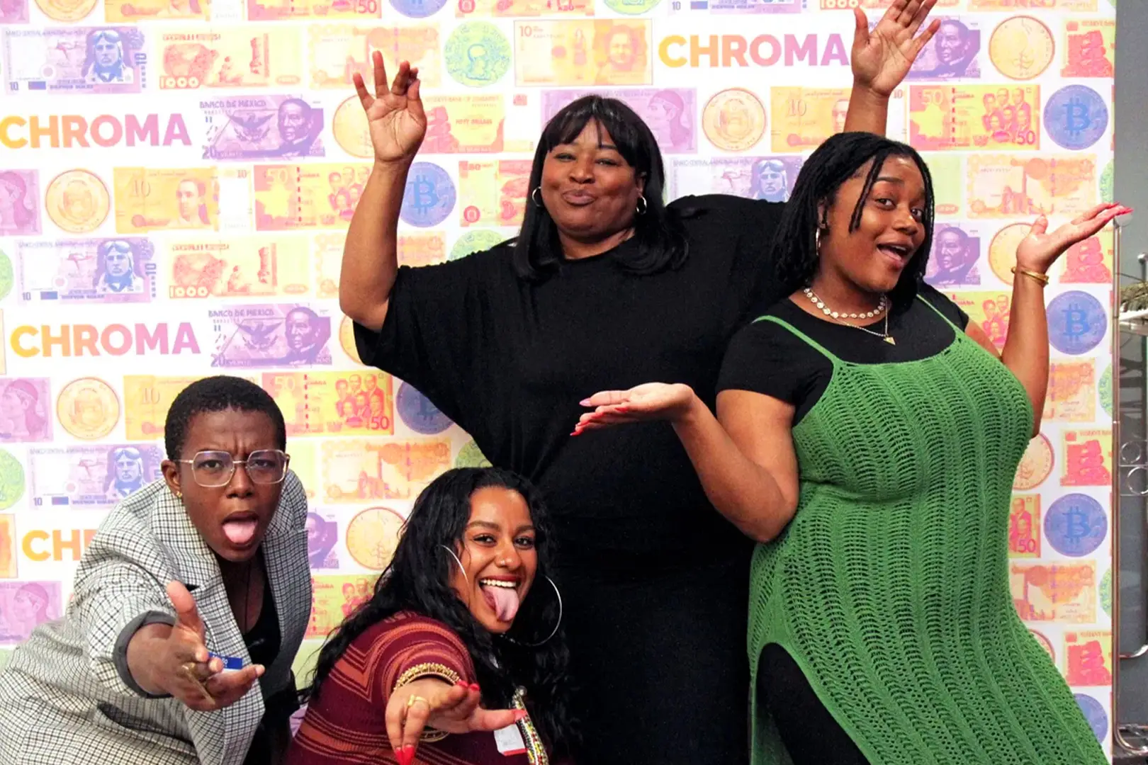
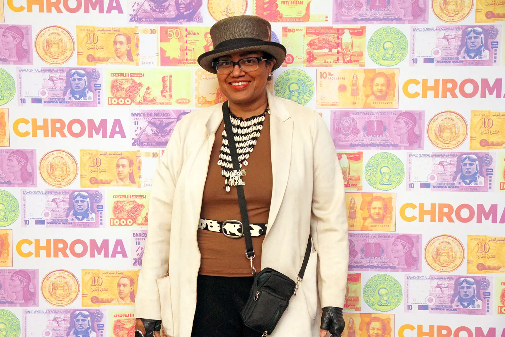
Most step and repeats are logo walls. We treat them as moments. For Culture Meets Money we patterned the wall with currency from across the Black and brown diaspora, recolored into the Chroma palette, so the backdrop said the theme out loud: this is where culture meets money. It still did everything a step and repeat has to do, naming the organizers and the sponsors, and then it went a step further and spoke to the intention of the whole event. People loved it.
“Studio J Lorne, makes us look good. The attention to our community, audiences, and stakeholders gives us a leg up as a small organization.”